My search for perfect color calibration began during a service call from the charter.com folks. Even thought the signals bars were strong and the cable box had been changed the TV card on this computer was missing channels. Turned out that by some quirk of the transmission, reflection and absorption properties of cable connections, the frequencies of my missing channel were being dragged into kaput-land. Moving heavy furniture and replacing a cable brought them back to life. Turns out cable TV electronic is as quirky and finicky as color management.
During the visit I resurrected my old 32bit machine to avoid running up and down two flights of stairs. It now has a small flat screen monitor and I saw that my carefully adjusted image of Matilda ( http://scribble-jpc.blogspot.com/2013/01/tone-mapping-using-ciecam02.html ) looked too bright. A trip next door to look on my neighbor's laptop confirmed my big OOPS. What I thought was an accurately calibrated monitor, my Sun workstation 567, was running a half stop too dark
To avoid another big OOPS I set my goals. I would recalibrate using my collection of Sherman Williams paint swatches. ( http://scribble-jpc.blogspot.com/2012/05/how-good-is-my-ancient-sun-workstation.html ) From http://www.color-swatches.com I would download virtual swatches that came with HSL-- Hue, Saturation and Lightness--and RGB numbers. I would adjust, adjust and adjust until I could lay the real swatch of the paint card against the virtual swatch visible on the monitor and not see a difference. Finally I snap a photo of that comparison with my D7000, display the image, and compare virtual to real again.
That turned out to be a quirky, tricky task. Not surprising since you can buy 500 page books just on the joys and groans of photographic color management.
I use Sherman Williams paint cards primarily because they supplied color-swatch.com with data for all the paints they sell. Other paint vendors don't. They also print good quality paint cards. Cards from other paint vendors will obviously work but for the record the photo above shows red #82 , green #105, blue #116 and yellow #86. If I was going to repeat this I would switch out the yellow for a card with a wider range of colors.
My Sun567 monitor has dual color adjustment, the usual brightness and contrast plus gain and bias adjustments for the individual color guns. I won't go into details about that leg of my search since it would be highly specific to a now very rare monitor except to say my attempt to use my D7000 spot meter as a radiometer fell apart because of the Sun's CRT raster scanning. In the end I ran the color gun gains up and adjust the monitor brightness by eyeball. Anyway, if you are using a typical flat screen monitor and not the more expensive professional models you don't have these adjustments. You take what the manufacture gives you.
To photograph and to view the paint swatches I bought two ecosmart 120 watt equivalent 1100 lumens 5000k daylight flood lamps from Home Depot. I set the white point of Sun567 to 5000k instead of the more normal 6500k to match the lighting. For the D7000 I shot at the neutral jpg setting using a custom WB taken with a 18% grey card.
The red circle shows the virtual swatch vs the paint chip and measures monitor calibration. The blue circle shows the double comparison. Both jps's are straight out of the camera without any manipulation and displayed using IRfanview.
I was pleased with the results as long as I ignored the swatches above and to a lesser extent below the matches. These comparisons went bad fast. But there are technical reasons for the problem.
The two swatches that match are titled 'picnic' and 'organic green'. Their Hue, Saturation and Lightness values are 108, 37, 69 and 105, 31, 79. These values are created by Photoshop in the virtual world and by laying down inks on card stock in the real world. They are fixed.
In the photography world the numbers are not fixed. Since we are dealing with subtractive color Hue Saturation and Lightness are derived from the spectra and intensity of the light being reflected off the paint chips, Something that is far from constant. And something sensitive to small differences.
How sensitive? If you look closely below the circled areas you can see what looks like a small dirt spec. It isn't. I'm holding the paint card. I can't see any dirt or change in color. But I can feel a slight dimple in the card stock. Since the spotlight is above and slightly in front of the monitor that dimple changed the incident light reflected back into the camera enough to darken the area and cause a hue shift.
The triangle thing in the upper right corner is the sheet of paper I moved about with one hand to attenuate the light as I snapped photos with my other hand. I took more than a few before I managed to adjust the angle of the card, the intensity of light and even where I was sitting in front of the monitor. Taking a good image for this blog wasn't a 'snap and go' task.
Taking a good 'eyeball shot' was easier. Twisting and bending the card until the colors blended and the seam between the monitor and paint card disappeared. This is also a good time to say that my eyeball matches were always better than my camera matches. The camera may be slightly off. Or maybe it is right on and my eyeballs are off. The CIECAM02 that I've been blogging is about the quirky way we humans view the world.
I would have ended the post here if I hadn't googled for a bit more info on color management in the middle of writing it. My Pantone huey calibrator came with a minimum manual, a single sheet, quick start guide. Since the Huey software has on screen instruction and defaulted to 'photo editing and web browsing' I hadn't worried much about the lack until I discovered that Pantone now has a pro version of the software. Its online manual told me I should use the 'Special Warm Medium Contrast' setting to match the 5000K lighting and monitor settings. Not a massive OPPS. All I had to do was change the setting, watch the colors shift and lay my paint card against the monitor. And... not quite a EUREKA moment...but close.
Matching four swatches rather than one or two is a significant improvement. So I won't talk about how much time I wasted trying to work out a lighting set up so I could match all seven swatches in one photo.
Hitting my goal this close is the good news. Now the bad. My local library branch has a hodge-podge of computers equipped with monitors of different ages and aspect ratios. I checked out all the ones that weren't being used without coming close to matching the paint cards. Worse, one was off so much the lighter swatches were blown out. The neighborhood center next door has newer monitors and better ambient lighting. My cards still didn't match, but the tonality and contrast looked more reasonable.
So while I have excellent color management on my system. I still publish most of my work on line. With so many uncalibrated monitors out in the world was all this effort worth the trouble? Comment are welcome.
Edit 3/1/13
The original post covered the eyeball, monitor, camera part of the calibration. Now the printer part.
Now and then I do a 4x6 on my old Epson, but the big prints I send out. This one was done at my local supermarket where they combine the best print job in the city with being the least expensive. They keep their Fuji Frontier 570 so well calibrated I see a near perfect color match with RawTherapee's sRGB output profile.
Now it's time to frame the print so it can go up on the wall tomorrow for my camera club's member show. Things are sweet.
Showing posts with label color purity. Show all posts
Wednesday, February 13, 2013
Tuesday, September 25, 2012
In Search of Perfect Color--the New Tone Curves
I shot this a while back at the Villas Zoo during its hundredth anniversary celebration. The Young Shakespeare Players were putting on a performance of The Winter's Tale in the zoo's meeting room. I caught these performers in a darkish corner and ended up with a not particularly exciting ISO1600 snapshot.
But after some very quick editing I turned the snap into this.
How quick? Here is my workflow.
1-loaded the snap into RT's default mode
2-set the highlights with a single drag using curve 1 of the new dual tone-curve set in the Film-like mode
3-set the shadows with another single drag using curve 2 in the Weighted Standard mode.
4--adjusted the exposure slider to move the histogram to the left for saturated blacks in the actor's hair and costumes.
5-dragged noise reduction sliders to roughly the settings I used for my last blog post.
6-developed and then cropped the finished image in Irfanview. Why Irfanview? Because in my excitement to see a final image I ignored the clutter surrounding my intended image.
Total working time now that I know what to do --two or three minutes per image Be less if I batch process the other ISO1600 snaps I shot before the play began. Not quite a one click clean up but RT is getting close. Plus the results are-- pure magic!
Two things you learn when you first take up image processing:
1-unless you have developed perfect technique, usually after decades of professional photography, images straight out of the camera improve with an S tone curve.
2- RGB colors will shift when you apply your tone curve.
1-unless you have developed perfect technique, usually after decades of professional photography, images straight out of the camera improve with an S tone curve.
2- RGB colors will shift when you apply your tone curve.
Applying a S-curve multiplies the color number in all three color channels by whatever numbers are created by the tone curve. Consider the RGB color 75,128,175 as an example. With a curve fixed at the grey point, 128, the red value will go down, the green will stay the same, and the blue will go up creating a different color. Since images and tone curves are unique designing a reasonable algorithm that can follow and corrects these color shifts becomes near impossible .
LAB mode is different. Tone curves in the L channel doesn't shift color. Unfortunately, correcting skin tones and the like with LAB's A and B channel curves is also near impossible. But with the RT's four HSV tone curves, near impossible is moving in on routine.
For those not familiar with HSV terminology the hue is the color. The chroma or saturation is the intensity of the color. The value is the brightness of the color. You can read off these numbers in RT's left history pane.
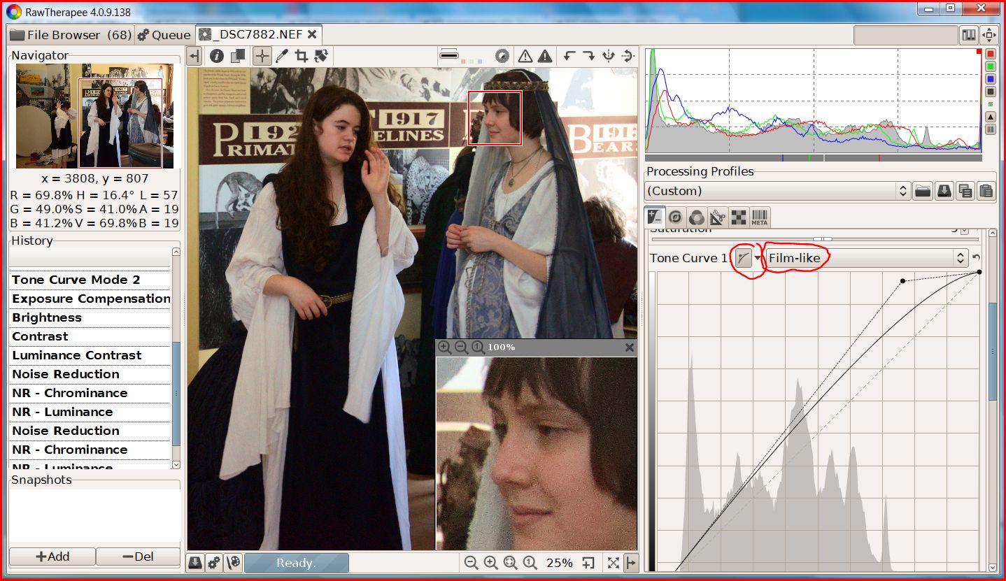
RT now has four different ways of creating a tone curve: Standard, Film-like, Saturation and Value Blending and Weighted Standard. I'll leave it to the RT programmers to explain the inner workings of the new algorithms in a promised tutorial because I suspect I'll get the details wrong. Whatever the details since you can mix and match the methods with dual curves you don't lack for ways to create excellent images.
EDIT: For more info on the four tone curve types you will find an updated manual at https://docs.google.com/document/d/1DHLb_6xNQsEInxiuU8pz1-sWNinnj09bpBUA4_Vl8w8/edit?pli=1
First why dual curves? In my example I created an S-Curve by combining two curves. This may seem like a needless complication--my first thoughts--until I saw how well and fast it works. And if you don't care for this new fangled innovation, set curve2 to linear and ignore it.
Below is a test image that one of the developers, Michael, posted. The differences are subtle and are best viewed at original size but in the dual curve version the skin tones blend in more smoothly as the lighting slides from highlights into shadows.
I haven't tested all the combinations in any systematic way but here are some tips I picked up from issue 1529 in the google code where many test images were posted.
Two standard curves (above) work well on skin tones.
Brightening with Film-like adds saturation and gives richer colors. So does switching to a wide gamut working space like ProPhoto. (I've tested this). But if you like your colors less vivid Saturation and Value Blending is the best choice.
Weighed standard for darkening and Film-like for lightening--my example--are a good combination for people pictures.
All methods work for landscapes. Selecting a mode depends on taste
Conventional S-curves work best with Saturation and Value Blend
Whatever curve modes you settle on, this unique feature is a major addition to RawTherapee's tool kit.
This version of RT 4, build 138, can be found at: http://www.visualbakery.com/RawTherapee/Downloads.aspx An updated manual is at: https://docs.google.com/document/d/1DHLb_6xNQsEInxiuU8pz1-sWNinnj09bpBUA4_Vl8w8/edit?pli=1
RT now has four different ways of creating a tone curve: Standard, Film-like, Saturation and Value Blending and Weighted Standard. I'll leave it to the RT programmers to explain the inner workings of the new algorithms in a promised tutorial because I suspect I'll get the details wrong. Whatever the details since you can mix and match the methods with dual curves you don't lack for ways to create excellent images.
EDIT: For more info on the four tone curve types you will find an updated manual at https://docs.google.com/document/d/1DHLb_6xNQsEInxiuU8pz1-sWNinnj09bpBUA4_Vl8w8/edit?pli=1
First why dual curves? In my example I created an S-Curve by combining two curves. This may seem like a needless complication--my first thoughts--until I saw how well and fast it works. And if you don't care for this new fangled innovation, set curve2 to linear and ignore it.
Below is a test image that one of the developers, Michael, posted. The differences are subtle and are best viewed at original size but in the dual curve version the skin tones blend in more smoothly as the lighting slides from highlights into shadows.
I haven't tested all the combinations in any systematic way but here are some tips I picked up from issue 1529 in the google code where many test images were posted.
Two standard curves (above) work well on skin tones.
Brightening with Film-like adds saturation and gives richer colors. So does switching to a wide gamut working space like ProPhoto. (I've tested this). But if you like your colors less vivid Saturation and Value Blending is the best choice.
Weighed standard for darkening and Film-like for lightening--my example--are a good combination for people pictures.
All methods work for landscapes. Selecting a mode depends on taste
Conventional S-curves work best with Saturation and Value Blend
Whatever curve modes you settle on, this unique feature is a major addition to RawTherapee's tool kit.
This version of RT 4, build 138, can be found at: http://www.visualbakery.com/RawTherapee/Downloads.aspx An updated manual is at: https://docs.google.com/document/d/1DHLb_6xNQsEInxiuU8pz1-sWNinnj09bpBUA4_Vl8w8/edit?pli=1
Subscribe to:
Posts (Atom)