Showing posts with label image processing. Show all posts

Wednesday, November 5, 2014

Using the B&W 'before' tools

There is a discussion  in the RT  forum about how to use the before and after curves in the b&w tool. My experience is that to set the color tonality you should make all needed adjustments before the B&W conversion.  Or to be specific when I convert  this candid shot to b&w how bright or how dark should I make the tones of the child's red dress and hair scarf


The b&w image using the default settings. I find it to be a bit washed out and 'blahh'


To make the child stand out from her father I lightened the red using the white balance tool, Or more accurately the white 'non balance' tool. I moved the temperature. tint and  r&b equalizer up until I had a red dress tonality much lighter than her father's shirt. Unfortunately the histogram is now too far to the right


To fix that problem I used a 'before' parameter curve.


This curve gave a full range of tones.  The kid stands out. The background is busy but not obtrusive. The details on the screen of the tablet are still visible. I should also mention that with the new 4.2.1 build there is much  more difference between curve type than with earlier versions. Using the same curve settings, the 'b&w film like' selection had much lighter darks that the 'b&w saturation and value' selection .

As for using an 'after' curve, my take is that all the real action is in the 'before' adjustments both inside and outside the b&w tool. If you want to do something like color toning with the LAB tools, go at it. But once the tonality and conversion parameters are set any 'after' curves should work the same way similar curves work outside. the b&w tool. So I will leave that for another discussion

The final image. Enjoy the kid's hands and frown. My balloon caption is "STOP, SNEAKY PAPARAZZI !!! MOMMY is taking MY PICTURE!!"


And for the record here is the totally non white balanced color image that produced the final b&w.


Sunday, April 7, 2013

Hidden Artist Strikes Again


I started with this-a 1949 cover for the Saturday Evening Post painted by Norman Rockwell


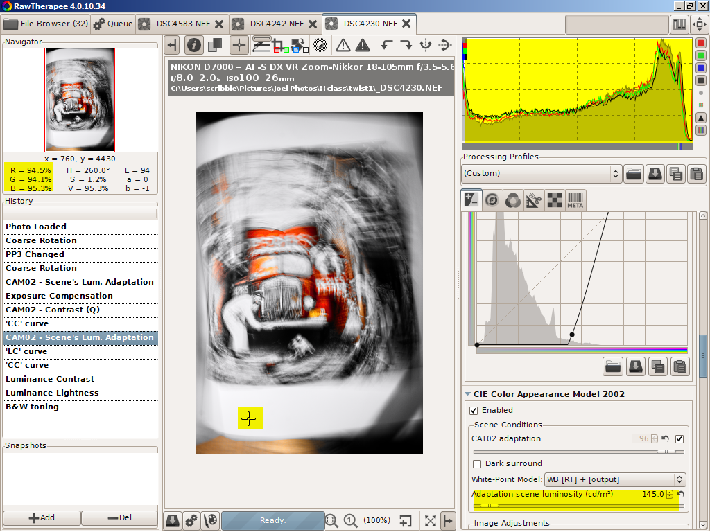
After I did my camera and photographer twisting and twirling I loaded the image into RT using the POP  profile.  This new addition to RT uses tonemapping and CIECAM02 to add, surprise, surprise, pop to your image.

To prevent one problem, jet black splotches that appear in highly over exposed areas when tonemapping and CIECAM02 are used together, Jacques, the developer who added CIECAN02 to our toolkit (applause, applause) made changes recently.  He compressed the highlights for well exposed images taken with bright scene illumination, the highlighted value of 2000 standard candles per meter squared.

 While that fixed one problem it added a second. For less well laminated scenes like indoor scenes with over exposed vistas viewed through windows, or like the low illumination I used to create this image, the histograms never go above 75%.  White areas end up too grey.

 The fix is blindingly obvious if you understand the intricate working of CIECAM02. You adjust the scene illumination slider to match the image. The histogram moves to the right; you stop when it starts to clip.  But the rest of us who think a standard candle is the long thin one you push into a brass candle stick we tend to miss what's needed to be done.

Yesterday afternoon I discovered that undocumented fix. Not by some brilliance on my part. In a not-so-secret forum where RT developers hang out and talk RT programming talk, this was being discussed in issue 1827. So last night, me, a lowly user, dared to tell Jacques, the developer, that his technically correct tool tip needed to be rewritten. In the middle of our night and his morning-the time difference between Wisconsin and France-Jacques wrote back saying of course he would do it

Took less than 8 hours. So if any users of commercial programs such as Lightroom happen to stumble over this blog please put in a request for the perfect fix you've been waiting to use. Then let us know how many weeks/months/years/eons it takes to get an answer back. RAWTherapee might bring on slider shock and have its quirks, but its developers listen. And when it rocks, it Rocks!

EDIT.  An Oops. Or semi Oops. What was less than blindingly obvious when I wrote this was that the real  cause of the problem was a bug in the CIECAM02  calculations. With build 4.0.10.69 that has been fixed, the problem no longer exist and the histograms no longer hang up at 75 percent no matter where you set the illumination slider.


A two slider adjustment in scene illumination and exposure moved the red channel to the clipping point and lightened the image.


A CIECAM02 contrast boost darkened the edges and clipped the red channel

.
A wild LAB custom CC curve made big changes to the image and brought all the channels together. Not the usual way to set a white balance.


A final scene illumination of 145 cd/m2 sets the overall image whiteness.


Two curve and slider adjustments didn't change the image that much. Running the chromaticity to the max, however, gave me a wild effect I could use.


The final masterpiece ready to be printed and matted for the masterclass.


And because it is also neat the black and white version created by clicking  BW tone mapping in the LAB section.

Saturday, March 30, 2013

The Artist Hidden Within

I'm taking a master class on how to drag the 'artist hidden within' out into the daylight. So for the next several weeks that hidden artist will be raising his sarky head and inflicting his 'masterpieces' upon the innocent blogosphere.

As any regular reader of this blog knows, the non hidden artist's aesthetic tends towards photographic perfection, the sort you pixel peek at 100% or higher to see. Accurate colors, perfect sharpness, noise freedom has reigned here.

The hidden artist, on the other hand, favors this.


The original Playboy style image that posed for the 'artist within' is from a 40 year old Petersen's Master of Contemporary Photography book about Bert Stern.  If the name Bert Stern isn't instantaneously recognizable  he's the photographer whose 1950's ads turned vodka, then a cold war Russian commie pinko exotic, into an all American drink. This really dry vodka martini ad was worth $4000 plus travel expenses in 1955 bucks. If his reputation has slipped a little since then he lived very well in his time.


Enough dry history. Here is the 'hidden artist's' RT workflow.

First select a colorful page or double page image to mangle. Set the camera to manual, to ISO100 or lower, to between 2 to 10 sec exposure and to whatever iris opening gives a reasonable photo. Move camera while snapping the photo. Better yet, twist, roll and yaw the photographer while snapping  the photo. Since you will have no idea what you have on the card, do this a dozen or more times. Load  the most interesting photo into RAWTherapee. Or in this case, one that didn't violate Blogspot's prohibition of full frontal nudity. Finally start the masterpiece making.


This brought out the color in the wide tie, the subject of the photo.


A hue slider adjustment that shifted the colors towards green. The CIECAM02 algorithm is 'all'.


Playing around with the CIECAM02 sliders brought us to this color mixture.


Since the colors aren't changing much 'the artist within'  turned this into a tiff file. Then he loaded that back into RT for further processing.


This lighten the background.


With this 'the artist within' laid down his mouse.  And left it to 'the outer guy' to write this blog post. He liked this version the best.


RAWTherapee 4.0.10.36 is now here. Besides speedups and bug fixes, it offers a new set of packaged profiles and two new demosaicing algorithms intended  for use with HighISO images. (Big Grin)

http://www.visualbakery.com/RawTherapee/Downloads.aspx

Monday, March 25, 2013

Creating Noise Profiles

I was asked what I use to create noise profiles. It is ImageJ'  a free cross platform Java app from NIH.  The best and ad free download site is from NIH-- http://rsbweb.nih.gov/ij/download.html

Once you have it installed  open your photo and choose your line type. Drag it across  the area of your photo where you want to measure noise.  Cntrl+K creates the graph.


To  change the Y scale of the graph go to edit, options, plot profile options


For  my measurement in the black area of this poster I picked  min 0, max 40


Once you have a flat noise profile, go to analyse, measure or hit Cntrl+M

For an accurate noise measurement signal average several. This is a square law thing so 4 measurements doubles your accuracy and 9 measurements triples it. Summarize will do the math where your Signal to Noise (S/N) is the Mean divided by the StdDev (Standard Deviation)


Is this conventional statistical definition of S/N to best way to characterize photographic signal to noise?Probably not.  Noise peaks, especially colored noise peaks, that jump out of the average noise are far more distracting than a mild increase in the average noise. So is pattern noise.  Both these noise problems will become lost in these numbers. But if you do these comparisons carefully ImageJ is a very useful tool for working out how well the various combinations of sliders and methods work for you.

Final note.  You can not save a picture of your graph directly in ImageJ. 'Save as' creates a spread sheet file, 'Clear\' clears out you mistakes and 'Rename' allows you to start a new results list without losing your previous numbers.

Again if you want to know more about noise read Emil's article,  http://theory.uchicago.edu/~ejm/pix/20d/tests/noise/noise-p2.html


Thursday, March 7, 2013

Kindergarten Snow Day---Another Quickie Workflow


The history of this less than impressive image started with flickr mail about non CPU manual lenses. I had accumulated a collection from garage sales, Craig's lists and on-line non ebay auction sites back when I was shooting with a Nikon D60. One lens was an Osawa 300mm f5.5. 

If I remember right curiosity drove that purchase.  Osawa?  Never heard the name. What kind of lens was that?  Osawa turned out to be a short lived 35mm camera maker from the 1970's. But a decent lens maker who, last time I googled, was still making lens for medium format cameras.

The lens did not disappoint and became part of my D60 kit. I posted some shots on flickr but when I bought the D7000 the lens was packed away and eventually buried under other boxes of good junk being sorted. Wife has ordered what threatens to turn into a massive Spring cleaning.  So when I received the email from another Nikon lens collector asking how it worked on a D7000, I had to find it. Which delayed any lens testing to the day of the latest Midwest mini-blizzard. 

The test target was house a hundred yards away from an upstairs bedroom window. The test was: yes the Osawa mounted and yes it took pictures. The fact that kids enjoying a snow day from kindergarten  wandered into the image part of frame and a hunk of out of focus curtain half filled the rest was coincidental. That the image ended up on my computer along with a directory full of more important shots was equally coincidental. That it wasn't immediately stripped down to loose pixels and tossed away into the reject bucket wasn't coincidental.

Recently I've been reading about photographic history and aesthetics.  The super sharp, noise free, tonally perfect aesthetic embraced by most of us RT users--why else would we put up with this many check boxes and sliders and even demand more -- can be traced back to photographers like Ansel Adams and Edward Weston. Both spent inordinate amount of time and effort in the darkroom producing perfect prints. But there were other aesthetics: the pictorialism of Stieglitz's Camera Works, the abstractions of Minor White's early Aperture, the photo montages of Rodchenko revolutionary posters--and so on.

 Let's call this an example of  Scribble's ...Colorism.


An auto levels exposure correction. If I had wanted to go for an Ansel Adams Zone System tonality I would use the black point slider to expand the histogram to fill the empty left section.


As good a time as any to crop. Since a square frame worked I fixed the ratio and invoked the rule of thirds. The big difference in the histogram came from cropping out the curtain.


A white balance in a snow scene is always a good idea even though in this image it didn't make much of a difference.


Now the Colorism created with CIECAM02.  The Contrast (up) and Brightness (down)  moved the snow into the unclipped but close to pure white area of the histogram.  The Colorfulness slider fully colorized our models, human and canine, and gave the image its snap.


Now a mini confession. My first workflow wasn't as quick and clean as this tutorials claims. I played around with slider and curve combinations, made a bunch of jpgs, sent one off to flickr and even collected a comment among the views. Wasn't til the end of the mini-blizzard and the snow blowing was over that I decided this might be worth a tutorial. So I duplicated the settings from memory.  And ended up liking my first version better.

A hint. If you ever need to duplicate an image or workflow and find yourself mentally kicking yourself  for not saving a profile, load the pp3 file of your good jpg into notepad and duplicate the settings. That will usually get you back to where you've been before.

Not my usual image but --sometimes you have to go wild and live dangerously.

Sunday, January 27, 2013

Tone Mapping JPGs---Or Why I'm Loving CIECAM02

At times we users fixate on the RAW part of RAWTherapee and fail to notice how great it is postprocessing JPGs. In fact I'd be willing to nominate RT, or should I say JT, as the best JPG editor on the Internet.

Example. I took this image last fall when Wife and I set out on a country ride to find a Halloween pumpkin for the front porch.  At a 'take your pick and please put the money in the cash box' roadside stand Wife walked about selecting the perfect pumpkin while I walked about snapping photos. Like this one of Indian corn.


The corn kernels are especially underexposed. I'd been shooting landscapes with the camera set to -0.33EV so not to blow out the skies and, as often happens, I forgot to change the setting . The camera also picked its exposure based on the bright husks. So how well will CIECAM02  tone mapping with JPGs?


Quite well as it turned out.

For the post proceed jpg I used pretty much the same workflow I described in my last post.
1-click the appropriate boxes to turn on the tools
2-click the highlight exposure warning icon. (white triangle on main tool bar)
3-use a single custom S curve to bring out the colors on the corn cob. When I went too far with the curve, the blown highlight on the individual corn kernels blackened. When I post processed a test jpg using that curve the rich colors washed out.
4-fine tune to taste using the Brighness, Colorfulnes and Contrast sliders

Are the results better or worse using the JPGs instead of NEFs?

 Wife walked in when I had a JPG version up on the screen next to a NEF version. She immediately picked the JPG version as the best. Since I'd used more Contrast on the JPG , I'd lean more towards a tie. With some images using a NEF would be better or even necessary. Recovering blown highlights, for instance, happens before the demosaicing step and won't work with a JPG. But with this image I could pixel peak with tight crops without seeing much difference.

So what are the advantages of using JPGs?

On the technical side speed and memory usage. Users with older 32 bits machines should find this quite useful.

And on the social side, there are mucho more JPGs out in the world than there are RAW files. Even on my machine. I have about five years of JPG only photography from before I owned a RAW enabled camera waiting to be sorted out and made more perfect for the digital version of the family album I've been promising to create.

No more excuses. Just don't tell Wife. Or even worse the Grandmas.

You can find this build of RT at-
http://www.visualbakery.com/RawTherapee/Downloads.aspx

Unfortunately as of January 27 there is no manual entry for CIECAM02. But it will appear shortly. The online manual is at-
https://docs.google.com/document/d/1DHLb_6xNQsEInxiuU8pz1-sWNinnj09bpBUA4_Vl8w8/edit

For Jacques's paper on CIECAM02-
http://jacques.desmis.perso.neuf.fr/RT/ciecamRT3.html


Monday, January 14, 2013

CIECAM02 What IS IT?

If everything goes as planned and everything on the to-do list is checked off the  next stable build, RT 4.1, will be posted in early February. That build promises mucho minor bug fixes, welcome speedups and CIECAM02.

So what is RAWTherapee's latest and greatest addition.  If you google CIECAM02 the wiki entry pops up at the top of the list. If you understand what you read there, email me a translation in people talk. You obviously understand what going on far better than I do. Tis a confusing topic.

In the RAWTherapee implementation we are looking at 12 different sliders coupled with three curve sets and  five curve types. So I will state upfront that if you are looking for a blog about adjusting this slider to create exactly that effect look somewhere else.  I'm not even close to working out those details. But I will say by dragging  sliders around without knowing  exactly what will happen I've corrected many color problems. I've also seen interesting tone mapped HDR images in the developer's forum.  for examples go to http://imgur.com/a/yqzLm#0

With a total of 12 sliders and 5 curves types  CIECAM02 corrects the subtle and not so subtle differences in how we humans see a scene or image and how cameras makes an image. The most obvious difference is chromatic constant or in photographer talk white balance. Another effect, seen by anyone who has thumbed through an optical illusion book, is what wiki calls the white illusion. Both grey patches are identical but they look different when displayed against white or black backgrounds
.


The  'scene condition' section deals with these effects. To quote wiki 'Though the human visual system generally does maintain constant perceived color under different lighting, there are situations where the relative brightness of two different stimuli will appear reversed at different illuminance levels. For example, the bright yellow petals of flowers will appear dark compared to the green leaves in dim light while the opposite is true during the day. This is known as the  Purkinje effect, and arises because the peak sensitivity of the human eye shifts toward the blue end of the spectrum at lower light levels.'

The top slider makes only minor adjustments to the histogram. I check the auto adjustment box in the corner.  With the dark surround--for example viewing a  framed photo hung in a dark hallway-- the change is more pronounced. To counter the Punkinje effect, it shifts the blue channel in the histogram. There are two algorithms for this, the first using only the normal RT adjustments with the second factoring in the CIECAM02 adjustments.


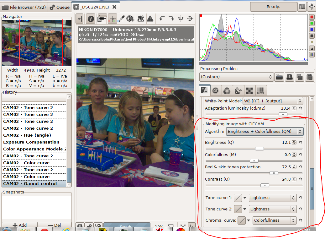
 In the next section there are 9 different sliders if I show them all.


Since I did the screen shots out of order, this is the photo I wanted to create. I started with the shot below, an ISO6400 image deliberately underexposed so I could shoot at 1/125 second when the girls were bowling.


I worked with the brightness and colorfulness algorithm. Instead of colorfulness I could have chosen chroma or saturation. To quote wiki  "colorfulnesschroma, and saturation are related but distinct concepts referring to the perceived intensity of a specific colorColorfulness is the degree of difference between a color and grayChroma is the colorfulness relative to the brightness of another color that appears white under similar viewing conditions. Saturation is the colorfulness of a color relative to its own brightness.Perhaps there are technical advantages to using the other two choices, but I haven't found any yet.


After adjusting for exposure and white balance I did a curves adjustment on colorfulness to create a brightly saturated cake and table cloth along with neutral and slightly subdued skin tones. The dull slider made big changes, the neutral slider didn't do much. With the strong blues and purples in this image the pastel slider shifted the colors more than the saturation slider. When I switched from colorfulness to chroma or saturation the colors shifted slightly. In short with curves and the sliders  I could smoothly adjust the colors to just about anything I wanted. 

Pushing  matters further, with hue slider I could dress the girls in green without destroying the skin tones. 


Finally there is a set of adjustments to correct the differences between viewing an image on a monitor in a well lit room, on TV screen in a darker room or using a projector in a very dark room 

To sum up CIECAM02 is an excellent addition to RAWTherapee

Tuesday, September 25, 2012

In Search of Perfect Color--the New Tone Curves


I shot this a while back at the Villas Zoo during its hundredth anniversary celebration. The Young Shakespeare Players were putting on a performance of The Winter's Tale in the zoo's meeting room.  I caught these performers in a  darkish corner and ended up with a not particularly exciting ISO1600  snapshot.


But after some very quick editing I turned the snap into this.


How quick? Here is my workflow.
1-loaded the snap into RT's default mode
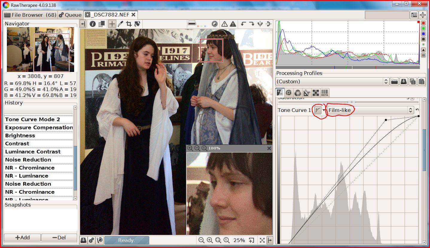
2-set the highlights with a single drag using curve 1 of the new dual tone-curve set in the Film-like mode


3-set the shadows with another single drag using curve 2 in the Weighted Standard mode.


4--adjusted the exposure slider to move the histogram to the left for saturated blacks in the actor's hair and costumes. 

5-dragged noise reduction sliders to roughly the settings I used for my last blog post.

6-developed and then cropped the finished image in Irfanview. Why Irfanview?  Because in my excitement to see a final image I ignored the clutter surrounding my intended image.

Total working time now that I know what to do --two or three minutes per image  Be less if I batch process the other ISO1600 snaps I shot before the play began. Not quite a one click clean up but RT is getting close. Plus the results are-- pure magic!

Two things you learn when you first take up image processing:
1-unless you have developed perfect technique, usually after decades of  professional photography, images straight out of the camera improve with an S tone curve.
2- RGB colors will shift when you apply your tone curve.

Applying a S-curve multiplies the color number in all three color channels by whatever numbers are created by the tone curve.  Consider the RGB color  75,128,175 as an example. With a curve fixed at the  grey point, 128, the red value will go down, the green will stay the same, and the blue will go up creating a different color. Since images and tone curves are unique designing a reasonable algorithm that can follow and corrects these color shifts becomes near impossible .

LAB mode is different. Tone curves in the L channel doesn't shift color. Unfortunately, correcting skin tones and the like with LAB's A and B channel curves is also near impossible.  But with the RT's four HSV tone curves, near impossible is moving in on routine.


For those not familiar with HSV terminology the hue is the color.  The chroma or saturation is the intensity of the color. The value is the brightness of the color. You can read off these numbers in RT's left history pane.

RT now has four different ways of creating a tone curve: Standard, Film-like, Saturation and Value Blending and Weighted Standard. I'll leave it to the RT programmers to explain the inner workings of the new algorithms in a promised tutorial because I suspect I'll get the details wrong. Whatever the details since you can mix  and match the methods with dual curves you don't lack for ways to create excellent images.

EDIT: For more info on the four tone curve types you will find an updated manual at https://docs.google.com/document/d/1DHLb_6xNQsEInxiuU8pz1-sWNinnj09bpBUA4_Vl8w8/edit?pli=1


First why dual curves? In my example I created an S-Curve by combining two curves. This may seem like a needless complication--my first thoughts--until I saw how well and fast it works. And if you don't care for this new fangled innovation, set curve2 to linear and ignore it.

Below is a test image that one of the developers, Michael, posted. The differences are subtle and are best viewed at original size but in the dual curve version the skin tones blend in more smoothly as the lighting slides from highlights into shadows.


I haven't tested all the combinations in any systematic way but here are some tips I picked up from issue 1529 in the google code where many test images were posted.

Two standard curves (above) work well on skin tones.

Brightening with Film-like adds saturation and gives richer colors. So does switching to a wide gamut working space like ProPhoto. (I've tested this). But if you like your colors less vivid Saturation and Value Blending is the best choice.

Weighed standard for darkening and Film-like for lightening--my example--are a good combination for people pictures.

All methods work for landscapes. Selecting a mode depends on taste

Conventional S-curves work best with Saturation and Value Blend

Whatever curve modes you settle on, this unique feature is a major addition to RawTherapee's tool kit.

This version of RT 4, build 138, can be found at: http://www.visualbakery.com/RawTherapee/Downloads.aspx   An updated manual is at: https://docs.google.com/document/d/1DHLb_6xNQsEInxiuU8pz1-sWNinnj09bpBUA4_Vl8w8/edit?pli=1