Showing posts with label chroma. Show all posts

Thursday, March 7, 2013

Kindergarten Snow Day---Another Quickie Workflow


The history of this less than impressive image started with flickr mail about non CPU manual lenses. I had accumulated a collection from garage sales, Craig's lists and on-line non ebay auction sites back when I was shooting with a Nikon D60. One lens was an Osawa 300mm f5.5. 

If I remember right curiosity drove that purchase.  Osawa?  Never heard the name. What kind of lens was that?  Osawa turned out to be a short lived 35mm camera maker from the 1970's. But a decent lens maker who, last time I googled, was still making lens for medium format cameras.

The lens did not disappoint and became part of my D60 kit. I posted some shots on flickr but when I bought the D7000 the lens was packed away and eventually buried under other boxes of good junk being sorted. Wife has ordered what threatens to turn into a massive Spring cleaning.  So when I received the email from another Nikon lens collector asking how it worked on a D7000, I had to find it. Which delayed any lens testing to the day of the latest Midwest mini-blizzard. 

The test target was house a hundred yards away from an upstairs bedroom window. The test was: yes the Osawa mounted and yes it took pictures. The fact that kids enjoying a snow day from kindergarten  wandered into the image part of frame and a hunk of out of focus curtain half filled the rest was coincidental. That the image ended up on my computer along with a directory full of more important shots was equally coincidental. That it wasn't immediately stripped down to loose pixels and tossed away into the reject bucket wasn't coincidental.

Recently I've been reading about photographic history and aesthetics.  The super sharp, noise free, tonally perfect aesthetic embraced by most of us RT users--why else would we put up with this many check boxes and sliders and even demand more -- can be traced back to photographers like Ansel Adams and Edward Weston. Both spent inordinate amount of time and effort in the darkroom producing perfect prints. But there were other aesthetics: the pictorialism of Stieglitz's Camera Works, the abstractions of Minor White's early Aperture, the photo montages of Rodchenko revolutionary posters--and so on.

 Let's call this an example of  Scribble's ...Colorism.


An auto levels exposure correction. If I had wanted to go for an Ansel Adams Zone System tonality I would use the black point slider to expand the histogram to fill the empty left section.


As good a time as any to crop. Since a square frame worked I fixed the ratio and invoked the rule of thirds. The big difference in the histogram came from cropping out the curtain.


A white balance in a snow scene is always a good idea even though in this image it didn't make much of a difference.


Now the Colorism created with CIECAM02.  The Contrast (up) and Brightness (down)  moved the snow into the unclipped but close to pure white area of the histogram.  The Colorfulness slider fully colorized our models, human and canine, and gave the image its snap.


Now a mini confession. My first workflow wasn't as quick and clean as this tutorials claims. I played around with slider and curve combinations, made a bunch of jpgs, sent one off to flickr and even collected a comment among the views. Wasn't til the end of the mini-blizzard and the snow blowing was over that I decided this might be worth a tutorial. So I duplicated the settings from memory.  And ended up liking my first version better.

A hint. If you ever need to duplicate an image or workflow and find yourself mentally kicking yourself  for not saving a profile, load the pp3 file of your good jpg into notepad and duplicate the settings. That will usually get you back to where you've been before.

Not my usual image but --sometimes you have to go wild and live dangerously.

Thursday, January 17, 2013

Tone Mapping using CIECAM02


Edit--Preliminary results of the "Perfect Monitor Chase" (see next post)
Compared to flat screen monitors my Sun workstation monitor is too dark by about .5 ev. So what I thought was perfect exposure and color--what this blog post is about--will--most likely--look overexposed and washed out on your monitor.

Why 'most likely'?  Because flat screens are all over the place. My local library has a wide assortment. On Internet 7 this blog post looked pretty good. On Internet 2 its colors were so garish I cringed. So I leave this edit  by saying the examples I posted might look terrible but I still stand by the workflow instructions.

Plus, if anyone knows an accurate way to set up the gain and bias of the three RGB guns in this beast leave a comment to point me in the right direction.


In my last post on CIECAM02 I mentioned tone mapping  without going into details. While I did have a build, #181, that integrated both tools, my sys7 64 bit windows system did not like the build. It was compiled on a 32 bit Linux computer and worked great with that operating system.  But it came without a windows installer to register  its dlls and after an average of ten slider adjustments it crashed. Not an ideal way to learn how to use a new tool.

Edit  Build 185 is now available for both 32 and 64 bit PCs. Looks to be rock sold and faster than before.You can find it at Ollis's site:
  http://www.visualbakery.com/RawTherapee/Downloads.aspx


Despite the crashes, the build gave off hints of great things to come. So, without any great expectations of success, I went down to the old office turned junk room to dust off my old 32 bit Vista machine. To my surprise, as long as I didn't run out of memory during a conversion, the build worked.


I started with a snap of Matilda before we went to the bowling alley for Charlotte's birthday party. It was the first in a series so I suspect I took it to test the lighting conditions. Not a totally bad snap, but it needed fixing before I could email it to Matilda.

Without going into the details which I'll save for after a final release, here are the results.
The old way, using LAB mode and without CIECAM02.


And the new way


Before CIECAM02 I might have been satisfied with the first version, but there is no question that the second version does a much better job correcting the blown highlights in Matilda's hair.

Her face is still shaded more that I like with red channel number of about 50 percent. If I increased the strength of the tone mapping to lighten it, white blotches with a black center appear on Matilda's little hair pin and then on the blown parts of her hair. This is not a bug. The white happens when tone mapping runs out of data (RGB 255, 255, 255) and the black when the algorithm overflows. On PCs and perhaps MACs this produces a negative number, something RAWTherapee and other image processor interpret as black. (RGB 0,0,0).  Even RAWTherapee can't fix everything.

In my last post I also said I hadn't found much difference between the three 'lightness vs xxxx' algorithms. This time, with Matilda's hair, the 'lightness vs chroma' worked best. CIECAM02 also has its built in "lightness' curves. I used those to bring up the red channel on Matilda's forehead to about 62 percent.


Which brings up another complication. After I installed my #181 build on my old 32 bit machine I created the three tone mapped images. They looked good downstairs. But when I brought them up to my 64 bit machine they looked much too dark.  Last summer  I blogged about how accurately I calibrated the antique Sun Workstation monitor using paint chips but CRT monitors do drift, especially older ones. As for the monitor downstairs, it is a flat screen that I bought in a garage sale for $2-- one not guarantied to be on the gold standard for monitor accuracy.

My laptop and third computer is currently in parts since I have to replace its CPU fan, so I went over to my next door neighbor to check how the images looked on his new laptop--somewhere in between what I was seeing on my computers.

This is a problem that the old timer darkroom print folks in my computer club have been trying to pound into the heads of us new timer digital folks. You can not guarantee how light or dark the images you slaved over to get perfect will look when they pop up on other people's monitors out in Internet Land. So if you enjoy these tutorials  please take a moment to add a comment--just a 'too dark' or 'washed out' or 'about right'  to let me know what you are seeing.  Blogging on how great RAWTherapee is while using bad imagery isn't convincing.

Double Thanks.
scribble


EDIT
Sorry if you ran into the "prove you are not a robot" thingy during a comment. Now off. So comment away.

Monday, January 14, 2013

CIECAM02 What IS IT?

If everything goes as planned and everything on the to-do list is checked off the  next stable build, RT 4.1, will be posted in early February. That build promises mucho minor bug fixes, welcome speedups and CIECAM02.

So what is RAWTherapee's latest and greatest addition.  If you google CIECAM02 the wiki entry pops up at the top of the list. If you understand what you read there, email me a translation in people talk. You obviously understand what going on far better than I do. Tis a confusing topic.

In the RAWTherapee implementation we are looking at 12 different sliders coupled with three curve sets and  five curve types. So I will state upfront that if you are looking for a blog about adjusting this slider to create exactly that effect look somewhere else.  I'm not even close to working out those details. But I will say by dragging  sliders around without knowing  exactly what will happen I've corrected many color problems. I've also seen interesting tone mapped HDR images in the developer's forum.  for examples go to http://imgur.com/a/yqzLm#0

With a total of 12 sliders and 5 curves types  CIECAM02 corrects the subtle and not so subtle differences in how we humans see a scene or image and how cameras makes an image. The most obvious difference is chromatic constant or in photographer talk white balance. Another effect, seen by anyone who has thumbed through an optical illusion book, is what wiki calls the white illusion. Both grey patches are identical but they look different when displayed against white or black backgrounds
.


The  'scene condition' section deals with these effects. To quote wiki 'Though the human visual system generally does maintain constant perceived color under different lighting, there are situations where the relative brightness of two different stimuli will appear reversed at different illuminance levels. For example, the bright yellow petals of flowers will appear dark compared to the green leaves in dim light while the opposite is true during the day. This is known as the  Purkinje effect, and arises because the peak sensitivity of the human eye shifts toward the blue end of the spectrum at lower light levels.'

The top slider makes only minor adjustments to the histogram. I check the auto adjustment box in the corner.  With the dark surround--for example viewing a  framed photo hung in a dark hallway-- the change is more pronounced. To counter the Punkinje effect, it shifts the blue channel in the histogram. There are two algorithms for this, the first using only the normal RT adjustments with the second factoring in the CIECAM02 adjustments.


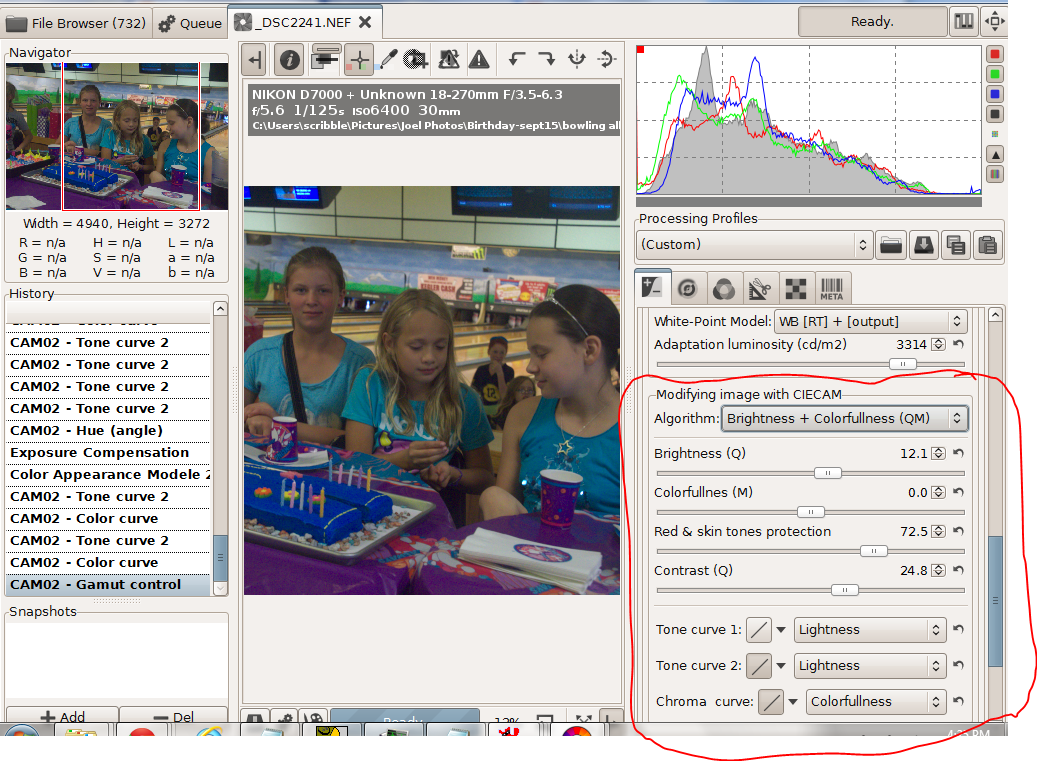
 In the next section there are 9 different sliders if I show them all.


Since I did the screen shots out of order, this is the photo I wanted to create. I started with the shot below, an ISO6400 image deliberately underexposed so I could shoot at 1/125 second when the girls were bowling.


I worked with the brightness and colorfulness algorithm. Instead of colorfulness I could have chosen chroma or saturation. To quote wiki  "colorfulnesschroma, and saturation are related but distinct concepts referring to the perceived intensity of a specific colorColorfulness is the degree of difference between a color and grayChroma is the colorfulness relative to the brightness of another color that appears white under similar viewing conditions. Saturation is the colorfulness of a color relative to its own brightness.Perhaps there are technical advantages to using the other two choices, but I haven't found any yet.


After adjusting for exposure and white balance I did a curves adjustment on colorfulness to create a brightly saturated cake and table cloth along with neutral and slightly subdued skin tones. The dull slider made big changes, the neutral slider didn't do much. With the strong blues and purples in this image the pastel slider shifted the colors more than the saturation slider. When I switched from colorfulness to chroma or saturation the colors shifted slightly. In short with curves and the sliders  I could smoothly adjust the colors to just about anything I wanted. 

Pushing  matters further, with hue slider I could dress the girls in green without destroying the skin tones. 


Finally there is a set of adjustments to correct the differences between viewing an image on a monitor in a well lit room, on TV screen in a darker room or using a projector in a very dark room 

To sum up CIECAM02 is an excellent addition to RAWTherapee