Showing posts with label birthday party. Show all posts

Wednesday, June 5, 2013

Noisewise, Is My Camera Meeting Spec?

Noise spec? you ask.  Point to where that is printed on the camera's spec sheet, you demand.  Sorry, camera manufacturers don't  spec their noise or more accurately their signal to noise ratios. Why? Maybe it's because some of us meany pixel peepers might take the number seriously and start demanding refunds. Or, to be more charitable, it might be because accurately measuring a camera's S/N ratio takes more than a look at a computer screen?

Physics-wise, S/N ratios are complicated. Photon shot noise, addition in quadrature, Poisson  statistics--those sort of things. Complications on top of complications.

A more reasonable question would be "Is my camera as good as the camera that was used  to take the photos for the review I read on my favorite photo site? The one that convinced me to buy the camera?"

If you are lucky, yes. More likely, no. Any marketing manager worth his corner office will make sure the cameras sent to review sites were hand picked for performance. But your camera should be close or you do have the right to demand your pixel peepin' refund.

This came up in the forums recently. A new user had bought a 'bridge' camera or, as I used to call them before marketing folks invented the name, a super zoom.  Those types of cameras have little sensors since, among other things, their light weight and inexpensive super zoom lenses only make little circles of focused light. Since they also pack about 12 megapixels into their little sensor--lets say the trade offs are not favoring S/N ratios and low light performance.

Our new user picked the right place to fix his noise problems even though his expectations were originally too high. RawTherapee has great noise reduction tools but there are limitations. So a question came up. Was his camera's S/N ratio within 'spec'?

Here is the workflow I used to work out the answer by using a comparison image, RawTherapee and ImageJ

I've already posted a tutorial on how to create a noise profile in ImageJ so I won't repeat the steps here.  http://scribble-jpc.blogspot.com/2013/03/crreating-noise-profiles.html

Imaging Resource is the place to go for your comparison images. http://www.imaging-resource.com/ They have created a massive data base of reference images going back to the days when a 2 megapixel camera equaled a $1000 investment. And they did things right from the start, controlling details, such as consistent lighting, needed to create reference images that highlight real differences between individual camera brands.

To download your comparison image pick your camera in the review pages, go to the sample tab and then the sample image page.


Near bottom and after a multitude of jpg images you will find Raw downloads of their multi-image test shot taken with your camera's various ISO settings. It has the Macbeth color chart we will use. I downloaded the ISO6400 version  to compare it with  the bowling alley picture I blogged about earlier.
 http://scribble-jpc.blogspot.com/2013/03/shoot-at-iso21000-print-at-30-by-45.html


Using the neutral profile I converted both NEFs  into jpgs before loading them into ImageJ. That conversion insures I was doing a real apples to apples experiment. If your camera doesn't take RAW files, obviously you must use jpgs but then your test image must have been taken with the same setting as the reference image for any meaningful results.


Pick the closest match you can find on your image, the wall behind Rhianna, and on the Imaging Resouces' multi image, the #4 gray scale box.  Run your profiles. Compare the graphs.

That's it. Twenty minutes time max and you know how well your camera is working. Take a few more measurement, let ImageJ do the signal averaging and you have an accurate S/N number.  Then you can brag about your new camera's performance in the forums. Or. more important, toss down a hard copy on the service desk if your camera needs fixing.

As for the new user who just posted his "Thanks" -- "You're more than welcome since your questions inspired this tutorial."

You can find RawTherapee 4.0.11.1 here. The package includes an updated manual

http://rawtherapee.com/blog/rawtherapee-4.0.11-released


Saturday, March 23, 2013

Shoot at ISO21000--Print at 30 by 45 inches

Sounds insane.  ISO21000 noise. Huge print size.  Welcome to the world of RAWTherapee noise reduction.


Rhianna is letting the world know she just bowled a strike.


The gory photo details. The camera was set to ISO6400-- which is just a conventional way of saying the D7000's sensor's true and only ISO100 signal is preamp boosted  by a factor of 64 before it enters the A/D.    Since the photo had to be boosted again by an exposure compensation of 1.8EV to shift the red histogram I multiplied the camera's ISO by 3.24 (1.8 squared)  to get a correct noise IS0 of 21000.

Ain't a cheating fudge factor. That's how sensor physics works.

Now the triumph of  RT noise reduction. But first here is what not to do.


I set the exposure compensation correctly before I went to the CIECAM02 tools to improve the color, contrast and lightness. But I forgot to return to exposure to readjust the histograms  When I caught my mistake, I checked the red color channel ( box at top) for blooming (red areas).  Because I liked my CIECAM02 fine tunings,  only one channel was effected  and the blooming area areas weren't in any critical part of the image (see http://scribble-jpc.blogspot.com/2013/02/rescuing-really-important-snapshots.html ) I decided to go with my mistake. After all I was getting a WOW Signal to Noise of 20!


Wrong move.  After wasting a bunch of time and discovering a few nagging inconsistencies  I corrected the exposure comp.  One measurement later and I discoverer the real double WOW WOW S/N was to be 28!!

A few points on experimental techniques. I took the noise line profile off Jilly's arm because that area has constant color--the curves are flat-- and the arm is close to the center of the tonal range--95 in a range of 0-255. These curves have to come out flat or don't bother doing the extra work to come up with a numerical signal to noise.  You will be measuring bumps and slopes.  Not the noise.

Looking more closely I should have shortened the length of the line profile of the last measurement  to get rid of the bump at the beginning. That error added about 0.5-1 to the last StdDev (standard deviation) number.  That's why I averaged 7 measurements to clean up these errors. Even without these moments of carelessness, remember we are dealing with noise. Three measurement are a minimum, 7 to 9 are better and a 100 measurements  would be an insane overkill.  We are doing a square law experiment and the Law of Diminishing Returns kicks in with the second measurment

Plus what's so wow about a S/N of 28. Why not 280 or even 2800. If you got  the bucks to buy the camera, like the Hubble Space Telescope or the Kepler Cosmic Background Radiation Telescope in the news recently, you can go for those high S/N ratios.  But for the rest of us, with this image taken under these exposure conditions, a S/N of 28 does equal a 30X45 poster pined to a bedroom wall.


With modern tech we can pixel-peep (and complain about what we see) far too easily. Rhianna's face is 8 inches wide on my super calibrated monitor (something that the world can't see --- for the complaint  http://scribble-jpc.blogspot.com/2013/02/in-search-of-perfect-eyeball-monitor.html ) . It is 3 inches on a 11 by 14 print I had made using the older 4.0.9.185 noise reduction.  Do the math and this is what you will see on a 30 X 45 inch wall poster.


That  print had a S/N of ~15.  If you were looking for noise there was a hint of it on Rhianna's face and in the brown area under the big number one in the background. But it's nothing that jumps out at you. I sure Rianna's mom won't complain when I give her the print next time I'm over in her part of the city.

EDIT--If you looked at this post before you might notice that Jilly has suddenly morphed into Rhianna.
Rhianna is Jilly's stepsister. They both live across the street from Charlotte. I got their names mixed up. Sorry girls. :-(

After I posted this I remember I do have a big display my flat screen LCD TV with its port in the side for usb sticks and memory cards.  When I displayed this image big it looked just like I said it would from my calculations.


The details from the pp3. I started with the HighISO profile. The exposure  comp of 0.88 I set. I may have fiddled with that other setting. Or they may have come with the profile.


[Exposure]
Auto=false
Clip=0.02
Compensation=0.88
Brightness=2
Contrast=22
Saturation=5
Black=332
HighlightCompr=0
HighlightComprThreshold=33
ShadowCompr=50
CurveMode=Standard
CurveMode2=Standard
Curve=0;
Curve2=0;

The image needed some sharpening. Except for 'only edges' the setting are the defaults. If it wasn't for the 'only edges' algorithm I never would have dared using sharpening on a high noise image.

[Sharpening]
Enabled=true
Method=usm
Radius=0.5
Amount=125
Threshold=20;80;2000;1200;
OnlyEdges=true
EdgedetectionRadius=1.8999999999999999
EdgeTolerance=1800
HalocontrolEnabled=false
HalocontrolAmount=85
DeconvRadius=0.75
DeconvAmount=75
DeconvDamping=20
DeconvIterations=30

White balance off Jilly's shirt

[White Balance]
Setting=Custom
Temperature=3058
Green=0.80500000000000005

The color and appearance fine tuning

[Color appearance]
Enabled=true
Degree=100
AutoDegree=true
Surround=Average
AdaptLum=16
Model=RawT
Algorithm=JC
J-Light=27.100000000000001
Q-Bright=-1
C-Chroma=-5
S-Chroma=0
M-Chroma=0
J-Contrast=44.5
Q-Contrast=64.5
H-Hue=0

The HighIso defaults. I could have fiddled with them for a better S/N but why bother. My 30 inch printer-imaginary- is out of ink-imaginary- and will stay that way given the cost of feeding a real printer. For five bucks and change I can get a 12 by 18 inch print from my local Woodmans-one that matches the image on my screen. As long as I switch the room lights back ovet to 5000K spots. Perfect color management ain't easy.

[Directional Pyramid Denoising]
Enabled=true
Luma=50
Ldetail=50
Chroma=50.689999999999998
Method=Lab
Redchro=0
Bluechro=0
Gamma=1.7


Find RAWTherapee  4.0.11.1 here
http://www.visualbakery.com/RawTherapee/Downloads.aspx

For an excellent tutorial on noise by Emil, the guru behind RT's new noise reduction systen
 http://theory.uchicago.edu/~ejm/pix/20d/tests/noise/noise-p2.html


Friday, March 8, 2013

It's Here!! RAWTherapee 4.0.10


No Noise Reduction


The new LAB noise reduction with its speed ups and individual noise channel controls.

Need I say anything more?  Yup. Great job RT folks!!

Find RAWTherapee  4.0.10.1 here

http://www.visualbakery.com/RawTherapee/Downloads.aspx

Thursday, January 17, 2013

Tone Mapping using CIECAM02


Edit--Preliminary results of the "Perfect Monitor Chase" (see next post)
Compared to flat screen monitors my Sun workstation monitor is too dark by about .5 ev. So what I thought was perfect exposure and color--what this blog post is about--will--most likely--look overexposed and washed out on your monitor.

Why 'most likely'?  Because flat screens are all over the place. My local library has a wide assortment. On Internet 7 this blog post looked pretty good. On Internet 2 its colors were so garish I cringed. So I leave this edit  by saying the examples I posted might look terrible but I still stand by the workflow instructions.

Plus, if anyone knows an accurate way to set up the gain and bias of the three RGB guns in this beast leave a comment to point me in the right direction.


In my last post on CIECAM02 I mentioned tone mapping  without going into details. While I did have a build, #181, that integrated both tools, my sys7 64 bit windows system did not like the build. It was compiled on a 32 bit Linux computer and worked great with that operating system.  But it came without a windows installer to register  its dlls and after an average of ten slider adjustments it crashed. Not an ideal way to learn how to use a new tool.

Edit  Build 185 is now available for both 32 and 64 bit PCs. Looks to be rock sold and faster than before.You can find it at Ollis's site:
  http://www.visualbakery.com/RawTherapee/Downloads.aspx


Despite the crashes, the build gave off hints of great things to come. So, without any great expectations of success, I went down to the old office turned junk room to dust off my old 32 bit Vista machine. To my surprise, as long as I didn't run out of memory during a conversion, the build worked.


I started with a snap of Matilda before we went to the bowling alley for Charlotte's birthday party. It was the first in a series so I suspect I took it to test the lighting conditions. Not a totally bad snap, but it needed fixing before I could email it to Matilda.

Without going into the details which I'll save for after a final release, here are the results.
The old way, using LAB mode and without CIECAM02.


And the new way


Before CIECAM02 I might have been satisfied with the first version, but there is no question that the second version does a much better job correcting the blown highlights in Matilda's hair.

Her face is still shaded more that I like with red channel number of about 50 percent. If I increased the strength of the tone mapping to lighten it, white blotches with a black center appear on Matilda's little hair pin and then on the blown parts of her hair. This is not a bug. The white happens when tone mapping runs out of data (RGB 255, 255, 255) and the black when the algorithm overflows. On PCs and perhaps MACs this produces a negative number, something RAWTherapee and other image processor interpret as black. (RGB 0,0,0).  Even RAWTherapee can't fix everything.

In my last post I also said I hadn't found much difference between the three 'lightness vs xxxx' algorithms. This time, with Matilda's hair, the 'lightness vs chroma' worked best. CIECAM02 also has its built in "lightness' curves. I used those to bring up the red channel on Matilda's forehead to about 62 percent.


Which brings up another complication. After I installed my #181 build on my old 32 bit machine I created the three tone mapped images. They looked good downstairs. But when I brought them up to my 64 bit machine they looked much too dark.  Last summer  I blogged about how accurately I calibrated the antique Sun Workstation monitor using paint chips but CRT monitors do drift, especially older ones. As for the monitor downstairs, it is a flat screen that I bought in a garage sale for $2-- one not guarantied to be on the gold standard for monitor accuracy.

My laptop and third computer is currently in parts since I have to replace its CPU fan, so I went over to my next door neighbor to check how the images looked on his new laptop--somewhere in between what I was seeing on my computers.

This is a problem that the old timer darkroom print folks in my computer club have been trying to pound into the heads of us new timer digital folks. You can not guarantee how light or dark the images you slaved over to get perfect will look when they pop up on other people's monitors out in Internet Land. So if you enjoy these tutorials  please take a moment to add a comment--just a 'too dark' or 'washed out' or 'about right'  to let me know what you are seeing.  Blogging on how great RAWTherapee is while using bad imagery isn't convincing.

Double Thanks.
scribble


EDIT
Sorry if you ran into the "prove you are not a robot" thingy during a comment. Now off. So comment away.

Monday, January 14, 2013

CIECAM02 What IS IT?

If everything goes as planned and everything on the to-do list is checked off the  next stable build, RT 4.1, will be posted in early February. That build promises mucho minor bug fixes, welcome speedups and CIECAM02.

So what is RAWTherapee's latest and greatest addition.  If you google CIECAM02 the wiki entry pops up at the top of the list. If you understand what you read there, email me a translation in people talk. You obviously understand what going on far better than I do. Tis a confusing topic.

In the RAWTherapee implementation we are looking at 12 different sliders coupled with three curve sets and  five curve types. So I will state upfront that if you are looking for a blog about adjusting this slider to create exactly that effect look somewhere else.  I'm not even close to working out those details. But I will say by dragging  sliders around without knowing  exactly what will happen I've corrected many color problems. I've also seen interesting tone mapped HDR images in the developer's forum.  for examples go to http://imgur.com/a/yqzLm#0

With a total of 12 sliders and 5 curves types  CIECAM02 corrects the subtle and not so subtle differences in how we humans see a scene or image and how cameras makes an image. The most obvious difference is chromatic constant or in photographer talk white balance. Another effect, seen by anyone who has thumbed through an optical illusion book, is what wiki calls the white illusion. Both grey patches are identical but they look different when displayed against white or black backgrounds
.


The  'scene condition' section deals with these effects. To quote wiki 'Though the human visual system generally does maintain constant perceived color under different lighting, there are situations where the relative brightness of two different stimuli will appear reversed at different illuminance levels. For example, the bright yellow petals of flowers will appear dark compared to the green leaves in dim light while the opposite is true during the day. This is known as the  Purkinje effect, and arises because the peak sensitivity of the human eye shifts toward the blue end of the spectrum at lower light levels.'

The top slider makes only minor adjustments to the histogram. I check the auto adjustment box in the corner.  With the dark surround--for example viewing a  framed photo hung in a dark hallway-- the change is more pronounced. To counter the Punkinje effect, it shifts the blue channel in the histogram. There are two algorithms for this, the first using only the normal RT adjustments with the second factoring in the CIECAM02 adjustments.


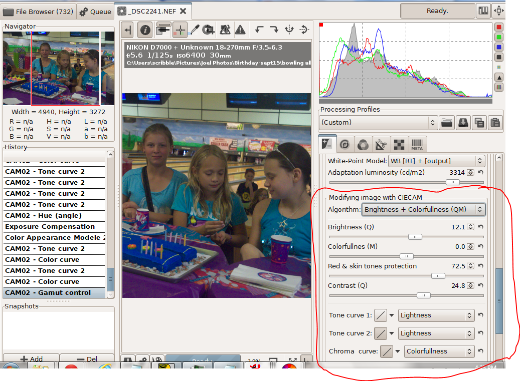
 In the next section there are 9 different sliders if I show them all.


Since I did the screen shots out of order, this is the photo I wanted to create. I started with the shot below, an ISO6400 image deliberately underexposed so I could shoot at 1/125 second when the girls were bowling.


I worked with the brightness and colorfulness algorithm. Instead of colorfulness I could have chosen chroma or saturation. To quote wiki  "colorfulnesschroma, and saturation are related but distinct concepts referring to the perceived intensity of a specific colorColorfulness is the degree of difference between a color and grayChroma is the colorfulness relative to the brightness of another color that appears white under similar viewing conditions. Saturation is the colorfulness of a color relative to its own brightness.Perhaps there are technical advantages to using the other two choices, but I haven't found any yet.


After adjusting for exposure and white balance I did a curves adjustment on colorfulness to create a brightly saturated cake and table cloth along with neutral and slightly subdued skin tones. The dull slider made big changes, the neutral slider didn't do much. With the strong blues and purples in this image the pastel slider shifted the colors more than the saturation slider. When I switched from colorfulness to chroma or saturation the colors shifted slightly. In short with curves and the sliders  I could smoothly adjust the colors to just about anything I wanted. 

Pushing  matters further, with hue slider I could dress the girls in green without destroying the skin tones. 


Finally there is a set of adjustments to correct the differences between viewing an image on a monitor in a well lit room, on TV screen in a darker room or using a projector in a very dark room 

To sum up CIECAM02 is an excellent addition to RAWTherapee