Showing posts with label Charlotte. Show all posts

Saturday, May 17, 2014

Matching skin tones for a Kodak Moment

Every now and then I've seen posts asking how to duplicate the look of a favorite film. I've played around with the idea myself with some occasional success.  Perhaps my most successful attempt was back in ancient years--my Photoshop days--where I exhibited an image that duplicated the National Geographic look of the 1920s and 1930s.  A bit of a hassle as I remember where it took several tries before what came off the print shop's Fuji Frontier machine look like what was printed in the magazine. A learning experience and my first attempt at color management.

Now we have RT with CIECAM . The tutorial is about duplicating what the 1950s ads in National Geographic called a Kodak Moment.


Why am I working on a jpg, Raw's poor and looked down upon cousin?  Because there are a lot of  jpgs out in the world, including a several year collection backed up on my computer. Call this a gentle reminder that RT is also one of the finest jpg editor around.

This image is from Charlotte's kindergarten dance recital. It was taken flashless and handheld with a point and shoot back when ISO400 was the ultimate in digital sensitivity. So it is nowhere near as crisp and noise free as an image I would take today. But it has family significance.

When Charlotte moved on to first grade she dropped out of dance because it was no longer just fun and play and had became real work learning real dance moves. But now that she is an almost seventh grader going on high school junior she has changed her mind. Her summer vacation will be afternoons of private dance lessons followed by several weeks of 8 to 5 dance camp. With weekly  recitals that I will immortalize in pixels and  then combine with the highlight of this recital to make a photobook or calendar for mom and the grandmas. Early Xmas shopping on steroids

Pass one was standard ISO high corrections to.brightened and cleaned up the image.


Pass two added an CIECAM tone curve to lighten the girls faces without washing out their costumes. Of the two curve choices the Lightness curve was stronger than the Brightness curve


Pass three was to use the  'All' algorithm to fine tune the facial tones of the image to match those on the cover of the Kodak pamphlet.  This wasn't done with any great science; just moving sliders around until the tone match looked reasonably close. Nor was this a challenging image since I was only working with one critical tone. But it does demonstrate a workflow.


 Converted with RawTherapee 4.0.12.165  which  can be found at http://rawtherapee.com/downloads

Friday, March 8, 2013

It's Here!! RAWTherapee 4.0.10


No Noise Reduction


The new LAB noise reduction with its speed ups and individual noise channel controls.

Need I say anything more?  Yup. Great job RT folks!!

Find RAWTherapee  4.0.10.1 here

http://www.visualbakery.com/RawTherapee/Downloads.aspx

Wednesday, February 27, 2013

Slider Shock or What Do I Do Now

You have  RT on the screen in front of you. You have read the first pages of the manual and now have the file browsers loaded with a directory full of images. You have selected your first RAW file. You are ready to fix problems.  Your snapshot will become a sent-to-all-the-grandmas minor masterpiece.

Then it hits you. Big Time.  Slider Shock!!. You think "Never Never in a Zillion years will I Learn how to use All those Sliders and Check Boxes."!! You mutter "I want my money back"! Then you remember RawTherapee is free.

Happen to everyone. Even me. And back then there were a bunch less sliders. But by now I've discovered the big RT secret.  Learning how to use all the sliders is for hang-on-the-wall-and-be-awarded-the-ribbon masterpieces. For the send-to-grandma ones you only use a few sliders. As for the rest--I must confess it wasn't until my last post that I needed to know much of anything about what was going on inside the RAW section. You can pick up most things as you go along.


This is a common exposure problem. Too light outside the window. Too dark inside the kitchen, The only thing correctly exposed  is the flowers on the window sill.  

The send-to-grandma workflow in seven easy steps:


Exposure compensation to 1.00.  This lightens Charlotte-the grandma interesting subject--but blows out the outside  foliage.


Enable HighLight Reconstruction. Because we are working with sky peaking through foliage I used the blend mode. The highlight recovery sliders-out of the picture- are at their default settings.


Now we are dealing with what I am beginning to think of as the twin power tools of RT. The four entries in  the history box appears when you set up Tone Mapping and CIECAM02 to work together. Just follow the steps in the Tone Mapping tool tip.


I used the control cage version of the Brightness curve and dragged it up until the snap was brighter than I wanted.


I fine tuned the snap with the Brightness and Colorfulness sliders. This shows the setting I decided to go with.


Rather than loading the snap into the queue. I copied my new procedure to the clipboard.


Finally I went back to the file browser, selected raw files with similar exposure problems, pasted my procedure and sent them all to the queue to be turned into grandma happy jpgs ready to be printed or emailed.

A couple of the jpgs that came out of the queue.


Not hard at all,  If you want to do additional work --a crop for instance--load up the raw files again. They will come up in 'last saved' mode ready to be worked on.

Sunday, February 24, 2013

Rescuing REALLY IMPORTANT snapshots from overexposure

Last summer Charlotte took her mother, her grandmother and me on a time travel adventure to Old World Wisconsin. She'd been there before on a school outing and promised to show us the really good places. I could even take my camera if I promised to document our adventures.

One of the good places was the blacksmith's shop where, as the only kid, she got to do all the fun stuff like working the air pump to heat up the forge fire so the blacksmith could bend an iron bar into a hook. She  even got to buy S hooks like she help make to hang up her REALLY IMPORTANT stuff in her bedroom As promised I documented her every move with my D7000  set at ISO2000.

Then it was across the road to the German farmhouse where it was washing day. She got to help here too, doing everything from pounding a shirt in the rinsing tub to twisting one end as she and the old timer haus frau wrung it out. Again, as promised, I documented every step. Then, horror of horrors, I discovered I'd forgotten to reset the camera's ISO. All the pictures of this REALLY IMPORTANT part of the adventure were overexposed!!


Can they be rescued? Ask RawDigger. Like RawTherapee it's a free download found at  http://www.rawdigger.com/  It's easy to use and will tell you all the things about your raw photos that you never thought to ask.


RawTherapee's highlight reconstruction works by using the data in the less damaged RGBG channels to fix the data in the totally blown channels. In this RGB render mode, you are looking at a rough color image created without a true demosaic or white balance  You can also look at the composite mode which is very green or at the individual color channels.

The red splotches show the blown areas: in lighter red where there is data in at least one channel; in darker red where all data is blown out. RawDigger will also shows underexposed areas using blue splotches.

The program has another feature  worth the downloading time if you are ever faced with a directory of overexposed  images. With a CTRL + left or right key I quickly stepped through the overexposed NEF files to grade them from 'easy fix' to 'this will take serious work in GIMP or Photoshop.'

I graded this image as moderately difficult. While there are numerous bright red patches that will cause problems they are not in areas that would do major damage if they didn't fully clean up. So for this tutorial I'll concentrate on Charlotte's shoulder and an area in the closest tub.

Next question:  what highlight reconstruct method should I use?  The choices are:

Luminance Recovery


CIELab Blending


Blend


and Color Propagation


With this image Color Propagation is so obviously superior--the wood grain in the tub, the strap on the shoulder-- you might ask why are the other methods still on the menu. One problem is Color Propagation can produce a reddish color cast. Something that is fine for skin tones but not so fine for violet tinted skies. A second problem is it may not work as well with other camera brands.

It certain doesn't work with all camera profiles. This image would have been an 'easy fix' if it wasn't for the way Nikon compresses data to a supposedly lossless raw file. Except for a few speckles the blue channel is not blown. At the moment RT doesn't have a D60 input profile so I cleaned it up using the camera standard profile.


And this interesting monstrosity  is what happened when I switched profiles to the Nikon D60 Adobe Standard.


All profiles are not created equal.

Finally this is my rescue workflow.

Reduce the exposure. With this photo by about -2 EV.


Go to Highlight Reconstruction with Color Propagation and let RT do its magic.


Charlotte's face is too dark.  Go  to CIECAM02 and added a parametric Lightness curve


That's it, Not perfect but from what I saw with RawDigger what I expected  Once all color channels are blown the data is gone forever and not even RT can bring  back fine detail like the wood grain in the bucket.. But RT can reconstruct colors in areas like Charlotte's shoulder where there is no important detail,  Plus in the final rendering the transitions are not as sharp as they look in the view boxes.

Tell the truth. If you hadn't been following the tutorial  would you have noticed Charlotte's shoulder or the wood grain in the bucket in this final image.


I'd like to thank iliasG and DrSlony for the advice they gave me. While any mistakes here are mine, if they hadn't set me straight on a few key matters, lets just say things would have been embarrassing. Some of my assumptions were not, in political media jargon, 'true facts.'

edit- DrSlony, an RT developer, sent me his workflow;

Scribble I use the "Blend" highlight reconstruction mode by default. Most of my shots are landscapes, which means I usually have time to plan the shot and there are not unexpected over-exposures. The Blend mode makes the transitions from well-exposed to over-exposed smooth and it keeps the overexposed area white, which is usually what I want. Color Propagation is amazing at reconstructing overexposed skin, so whenever that's the case I use CP. CP is also the only method for which you can move the Highlight Recovery slider well past 100. When you do that with the other methods, the overexposed areas quickly get dirty grey or some other form of ugly, but with CP you can easily go over 200 or even 300 and get a great looking result. CP fails at large overexposed areas, and it's slower than the others.

Anyone else who wants to contribute his or hers experience with RT is welcome to join in.


You can find this build of RT at-
http://www.visualbakery.com/RawTherapee/Downloads.aspx
The online manual is at-
https://docs.google.com/document/d/1DHLb_6xNQsEInxiuU8pz1-sWNinnj09bpBUA4_Vl8w8/edit


Tuesday, January 22, 2013

CIECAM02-a WORKFLOW

Edit--Preliminary results of the "Perfect Monitor Chase"
Compared to flat screen monitors my Sun workstation monitor is too dark by about .5 ev. So what I thought was perfect exposure and color--what this blog post is about--will--most likely--look overexposed and washed out on your monitor.

Why 'most likely'?  Because flat screens are all over the place. My local library has a wide assortment. On Internet 7 this blog post looked pretty good. On Internet 2 its colors were so garish I cringed. So I leave this edit  by saying the examples I posted might look terrible but I still stand by the workflow instructions.

Plus, if anyone knows an accurate way to set up the gain and bias of the three RGB guns in this beast leave a comment to point me in the right direction.


Now that we have an up to date--as of January 20 2013--64 bit win7 build on line, I was able to sit down and work out a workflow for tone mapping  using  CIECAM02.  Tone mapping is important to me since I take a lot of underexposed images. Sometimes deliberately. With low light  and moving subjects like Charlotte and her friends it's 1/125 second shutter priority and let the ISO fall where it may. I can deal with camera noise but blur is forever.

And sometimes...you know how it is keeping track of all those pesky camera settings. In the photo of Charlotte and her birthday check I faced harsh outdoor lighting coming over Charlotte's shoulder but I can't remember where  the  -.67 EV setting came from.

The original NEF converted with the RT neutral profile.


With a +1.41 EV exposure correction. Any greater exposure correction clipped the R channel at my test point on Charlotte's right leg up by her shorts. With this much EV the writing on the check and much of her right leg is washed out.  With deep shadows on her face this is a candidate for tone mapping.


Using the default setting of RT's original LAB based tone mapping . Tone mapping cleaned up the overexposed check and legs but didn't do much with the shadows on her face.


 The tool tip on tone mapping says to use CIECAM02:
1-check the box to enable the CIECAM02 tool- obvious
2 set the algorithm to Brightness + Colorfulness-less obvious
3-check the box to enable tone mapping using CIECAM02--again obvious

What to do next awaits a long manual entry. Jacques, the author of this masterpiece of post processing has written a long and programmer oriented paper on this tool. In French. His email English is far better than what's left of my high school French. So I depend on Google Translates. I won't say Google Translates totally mangles his French but I found it tough going pulling out the details. So if I've missed an obvious workflow...c'est la vie.

Step one of my version is to use the Brightness curves to brighten the image. I used tone mapping's default strength of  .25 but cut its Edge Stopping slider back to .55. It sharpens detail like Charlotte's hair and the default 1.4 setting seemed overaggressive.


I used the two control cage Brightness curves  for this post. After I'd made the screen clips I decided  it really did not matter what curve type or types I used. This step makes the image as bright as you can without clipping any of the color channels. So also check the 'show CIECAM02 histogram in curve' box. By design or bug it shows up only in the curve1 box. Adjust the curves so the histogram touches the right edge just short of clipping. A clipped channel will also develop a peak topped by a colored box in the main histogram box.

The image you get from curves alone is not likely to be pretty. This one is a bit washed out.


 So now you use the sliders to pretty it up.


Between Brightness, Colorfulness and Contrast you can fine tune to anything you want. For aesthetic reasons I set the yard behind Charlotte's head to almost total black. That made the shadows on her face a little darker than I would have liked. But all in all RT with CIECAM02 turned a disaster of a snap into something worth blogging about.

And there is more. CIECAM02 now works with Sharpening. Microcontrast, Defringe and Contrast by Detail.

With no sharpening


And with unsharp on and set a bit heavy. Don't know what they did but unsharp mask now seems to be less prone to halos and other artifacts


You can find this build of RT at-
http://www.visualbakery.com/RawTherapee/Downloads.aspx

Unfortunately as of  January 22 there is no manual entry for CIECAM02. But it will appear shortly. The online manual is at-
https://docs.google.com/document/d/1DHLb_6xNQsEInxiuU8pz1-sWNinnj09bpBUA4_Vl8w8/edit

For Jacques's paper on CIECAM02-
http://jacques.desmis.perso.neuf.fr/RT/ciecamRT3.html


Monday, January 14, 2013

CIECAM02 What IS IT?

If everything goes as planned and everything on the to-do list is checked off the  next stable build, RT 4.1, will be posted in early February. That build promises mucho minor bug fixes, welcome speedups and CIECAM02.

So what is RAWTherapee's latest and greatest addition.  If you google CIECAM02 the wiki entry pops up at the top of the list. If you understand what you read there, email me a translation in people talk. You obviously understand what going on far better than I do. Tis a confusing topic.

In the RAWTherapee implementation we are looking at 12 different sliders coupled with three curve sets and  five curve types. So I will state upfront that if you are looking for a blog about adjusting this slider to create exactly that effect look somewhere else.  I'm not even close to working out those details. But I will say by dragging  sliders around without knowing  exactly what will happen I've corrected many color problems. I've also seen interesting tone mapped HDR images in the developer's forum.  for examples go to http://imgur.com/a/yqzLm#0

With a total of 12 sliders and 5 curves types  CIECAM02 corrects the subtle and not so subtle differences in how we humans see a scene or image and how cameras makes an image. The most obvious difference is chromatic constant or in photographer talk white balance. Another effect, seen by anyone who has thumbed through an optical illusion book, is what wiki calls the white illusion. Both grey patches are identical but they look different when displayed against white or black backgrounds
.


The  'scene condition' section deals with these effects. To quote wiki 'Though the human visual system generally does maintain constant perceived color under different lighting, there are situations where the relative brightness of two different stimuli will appear reversed at different illuminance levels. For example, the bright yellow petals of flowers will appear dark compared to the green leaves in dim light while the opposite is true during the day. This is known as the  Purkinje effect, and arises because the peak sensitivity of the human eye shifts toward the blue end of the spectrum at lower light levels.'

The top slider makes only minor adjustments to the histogram. I check the auto adjustment box in the corner.  With the dark surround--for example viewing a  framed photo hung in a dark hallway-- the change is more pronounced. To counter the Punkinje effect, it shifts the blue channel in the histogram. There are two algorithms for this, the first using only the normal RT adjustments with the second factoring in the CIECAM02 adjustments.


 In the next section there are 9 different sliders if I show them all.


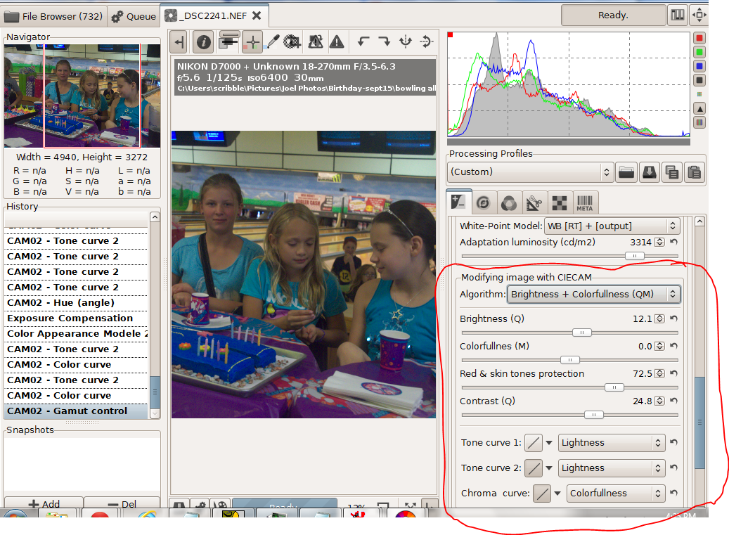
Since I did the screen shots out of order, this is the photo I wanted to create. I started with the shot below, an ISO6400 image deliberately underexposed so I could shoot at 1/125 second when the girls were bowling.


I worked with the brightness and colorfulness algorithm. Instead of colorfulness I could have chosen chroma or saturation. To quote wiki  "colorfulnesschroma, and saturation are related but distinct concepts referring to the perceived intensity of a specific colorColorfulness is the degree of difference between a color and grayChroma is the colorfulness relative to the brightness of another color that appears white under similar viewing conditions. Saturation is the colorfulness of a color relative to its own brightness.Perhaps there are technical advantages to using the other two choices, but I haven't found any yet.


After adjusting for exposure and white balance I did a curves adjustment on colorfulness to create a brightly saturated cake and table cloth along with neutral and slightly subdued skin tones. The dull slider made big changes, the neutral slider didn't do much. With the strong blues and purples in this image the pastel slider shifted the colors more than the saturation slider. When I switched from colorfulness to chroma or saturation the colors shifted slightly. In short with curves and the sliders  I could smoothly adjust the colors to just about anything I wanted. 

Pushing  matters further, with hue slider I could dress the girls in green without destroying the skin tones. 


Finally there is a set of adjustments to correct the differences between viewing an image on a monitor in a well lit room, on TV screen in a darker room or using a projector in a very dark room 

To sum up CIECAM02 is an excellent addition to RAWTherapee

Monday, July 16, 2012

First Look--RAWTherapee's New Noise Reduction

Last Wednesday during this hottest on record Midwest heat wave Charlotte and her Mom and I drove in air conditioned comfort  to tour Charlotte's favorite museum, the Milwaukee Public. There Charlotte became my guide. My Nikon D7000 hanging around my neck, she led me from exhibit to exhibit.

Excellent exhibits, I'll admit. But from a low light, hand held photographer's point of view, the trip was not a successs. The lighting, or lack of it, was the pits. Still, I snapped away and came home with a few GB's of images, hoping for some lucky shots.

What I discovered when I went to process the RAWs wasn't luck exactly. I've been following the development of RT's new noise reduction routines for over a year and I check their forum regularly. The developer's denoise compile I downloaded isn't bug free and only works with 64bit Win7, but with my new computer its match with my museum snaps was perfect.


This snap was taken at a 1/4 sec and ISO2500.  Charlotte held her pose. Image stabilization and I held the camera steady. After a 2 EV boast in exposure and a tone curve, it's a decent image to see how well RT's latest and greatest works. There is no manual entry yet but the routine turned out to be more automated than I expected and easy to work out.


The luminance slider sets the maximum strength of the noise reduction; the luminance detail slider sets how much of that maximum strength is actually used. At a detail setting of 100, no or very little noise reduction is applied. At 5 and with a strength of 20--the settings I used here--the noise reduction was both artifact free and very impressive. But I was clearly losing detail as you can see in comparison with an image with no noise reduction (right)  below


I'd gone too far. Below is a tuned version where I tried to preserve detail.


I kept the luminance setting at 20 but ran the detail slider up 60, added more unsharp mask sharpening and set the gamma to 1.4 to bias the noise reduction towards the shadows. Below is another comparison with the no noise reduction image. Beside being significantly less noisy the tuned image shows as much and perhaps even more detail than the no noise reduction image. Click on the image and go to the original size if you want a better view.

 (note--if you download this build from http://dl.free.fr/getfile.pl?file=/unoeMxPZ RL convolution sharpening is broken, When you process an image in the queue the software grabs all the available memory and crashes when it can not find more.)


To finish off this first look here are the respective noise profiles--05 detail on the top, tuned detail in the middle and no noise reduction on the bottom.


While this is not the released version and there are still some bugs to work out, I'm  very impressed. So congratulations to everyone involved.