After a major professional photoshoot--the cover and feature article in Australian Vogue--Lorde, the New Zealand songwriter and singer of Royals and Pure Heroine fame--posted a selfie on Instagram. So far 148 thousand of her 2.5 million followers have loved it
My 12 year old granddaughter didn't love it. Too, too noisy. So fix it. grandpa. (Got her RT trained since she was three and I gave her a big girl camera that took pictures of her feet and her cat and herself in a mirror)
Grandpa's two minute fix. Far less noise coupled with slightly more sharpening. The S/N was measured using ImageJ
****
The idea is to remove as much noise as possible and not worry about the sharpness. So there is nothing magic about the 91.59 luminescence. Could have been 100% if this wasn't a two minute fix and I had been paying more attention to the GUI fit on the screen.
****
Increasing the edge sharpness strength to 34 restored the original sharpness. Some small artifacts showed up as bright spots at 300% magnification. Using the denoise section of the tool removed most of them. I should note that the tool is still being debugged and improved so these minor artifacts may not be a problem in the next build.
Final note. The denoise slider numbers in the history panel are the correct numbers. The slider settings on the right are the defaults when I set the sharpening strength.
To download the latest version of RawTherapee go to http://rawtherapee.com/downloads
It's is open source, works great and will be forever free
Showing posts with label rawTherapee. Show all posts
Thursday, June 25, 2015
Wavelets and Lorde
Labels:
instagram,
jpg,
Lorde,
New Zealand,
noise reduction,
rawTherapee,
selfie,
songwriter,
tutorial,
wavelets
Friday, February 20, 2015
From Photo to Line Drawing....Without Leaving RawTherapee .
The jpg of the girl in the fur outfit has a moderate resolution: 804 by 629 pixels. While working with high resolution Raw files will generate interesting images, if you are after a line drawing medium resolution jpgs works best. That way you can view your image at 100 percent. You will be creating what would be called artifacts in a normal workflow and it is easy to go a bit too far with the sliders.
Step one
Step one
Start by upping the exposure compensation. For a realistic line drawing keep detail in at least one of the color channel in areas such as the girl's face. In other areas that will be paper white in the line drawing such as the girl's skirt you can push all channel to 100 percent,
Step two
Step two
Tone map the jpg to create edges without turning shadows into blotchy artifacts in area such as the girl's face.
Step three
Step three
If you like your original colors this and the next step are optional. Using the three color temperature sliders produces a wide range of color shifts ranging from a total color cast to a blue tinting of the edges created in step two.
Step four
Again this step is optional. The channel mixer switches the colors towards green.
Now another big reason for using roughly 800 pixel resolution jpgs, The bottom sliders in the contrast-by-detail tool creates hard edges. With higher resolution images the effect is nowhere as strong.
My original final image.
A water color perhaps rather than a line drawing but still an attractive image. Because of the interactions between the tools pushing beyond this didn't work out. But after I slept on the problem when I woke up I realize that if I did a second pass stating with my painterly jpg I wouldn't be fighting any interactions.
Repeating step one and two--more exposure, more tone mapping, and then setting the saturation down to -100 created this line drawing.
Tuesday, September 9, 2014
This Stage Shot is a RawTherapee Challange
At first look there is not much to see. I found the low res jpg while poking around in a Lorde fan site. Lorde is, if you are not up on your pop music, a New Zealand teenage who at 16 played her first show in a 140 seat Auckland pub half filled with relatives and school friends. Last month at 17 she up her audience to an estimated 70,000 to 80,000 at Lollapalooza in Chicago. And on September 26 she will be playing to a maybe sellout crowd of 5000 in Milwaukee. I will be sitting a few rows back from the stage with Charlotte and her BFF, Jessica. It's Charlotte's going-into-the-7th-grade-with-an-A-report-card birthday gift.
Naturally I will be there with a camera. Unfortunately it won't be my D7000. Only pocket cameras allowed. So I'm resurrecting my Canon S3IS, a 6mp oldie that hasn't seen a photo electron in years. It takes a moderately decent movie and can be updated with CHDK to output RAW files, Then I can handle some over exposure.
Unfortunately I expect a lot of overexposure. Lorde's new tour features a wild light show. A photographer's nightmare, the light show demands much under exposure (see above) or it will wash out a good hunk of everything on the stage. So I'll be depending on RT to drag details out of thick mud.

The fan site didn't lie. This is Lorde singing her double grammy winning super hit Royals. Auto exposure added 2.36 stops of exposure,
It's an obvious candidate for tone mapping.
CIECAM adjusted colors. contrast. and brightness.
Noise reductions did its thing. Since I started with a 464 x 750 pixel jpg there wasn't much detail to worry about. Another adjustment is needed to move the histogram to the left and darken the blacks.
A Kodachrome 64 film simulation both darkened the blacks and enhanced the red. I now had the dramatic look I was hoping to see
Finally I resized the photo. Because of the low res jpg don't look for fine details, but except for that problem this image is now a reasonable addition to a Lorde fan's twitter page . And I have a better idea of the photographic conditions I'll face at the concert.
After a few hours relearning how to use both the camera and CHDK I discovered the camera is less noisy than I feared. At ISO800 and exposures similar to the original jpg, RT gives me midtone to highlight S/N of 20 to 40. Not bad if it holds up at the concert. Plus if I go the CHDK raw route the camera has a stop of headroom for highlight reconstruction. So watch this spot after Sept26. I'll be posting a few examples on how things worked out.
Sunday, January 27, 2013
Tone Mapping JPGs---Or Why I'm Loving CIECAM02
At times we users fixate on the RAW part of RAWTherapee and fail to notice how great it is postprocessing JPGs. In fact I'd be willing to nominate RT, or should I say JT, as the best JPG editor on the Internet.
Example. I took this image last fall when Wife and I set out on a country ride to find a Halloween pumpkin for the front porch. At a 'take your pick and please put the money in the cash box' roadside stand Wife walked about selecting the perfect pumpkin while I walked about snapping photos. Like this one of Indian corn.
The corn kernels are especially underexposed. I'd been shooting landscapes with the camera set to -0.33EV so not to blow out the skies and, as often happens, I forgot to change the setting . The camera also picked its exposure based on the bright husks. So how well will CIECAM02 tone mapping with JPGs?
Quite well as it turned out.
For the post proceed jpg I used pretty much the same workflow I described in my last post.
1-click the appropriate boxes to turn on the tools
2-click the highlight exposure warning icon. (white triangle on main tool bar)
3-use a single custom S curve to bring out the colors on the corn cob. When I went too far with the curve, the blown highlight on the individual corn kernels blackened. When I post processed a test jpg using that curve the rich colors washed out.
4-fine tune to taste using the Brighness, Colorfulnes and Contrast sliders
Are the results better or worse using the JPGs instead of NEFs?
Wife walked in when I had a JPG version up on the screen next to a NEF version. She immediately picked the JPG version as the best. Since I'd used more Contrast on the JPG , I'd lean more towards a tie. With some images using a NEF would be better or even necessary. Recovering blown highlights, for instance, happens before the demosaicing step and won't work with a JPG. But with this image I could pixel peak with tight crops without seeing much difference.
So what are the advantages of using JPGs?
On the technical side speed and memory usage. Users with older 32 bits machines should find this quite useful.
And on the social side, there are mucho more JPGs out in the world than there are RAW files. Even on my machine. I have about five years of JPG only photography from before I owned a RAW enabled camera waiting to be sorted out and made more perfect for the digital version of the family album I've been promising to create.
No more excuses. Just don't tell Wife. Or even worse the Grandmas.
You can find this build of RT at-
http://www.visualbakery.com/RawTherapee/Downloads.aspx
Unfortunately as of January 27 there is no manual entry for CIECAM02. But it will appear shortly. The online manual is at-
https://docs.google.com/document/d/1DHLb_6xNQsEInxiuU8pz1-sWNinnj09bpBUA4_Vl8w8/edit
For Jacques's paper on CIECAM02-
http://jacques.desmis.perso.neuf.fr/RT/ciecamRT3.html
Example. I took this image last fall when Wife and I set out on a country ride to find a Halloween pumpkin for the front porch. At a 'take your pick and please put the money in the cash box' roadside stand Wife walked about selecting the perfect pumpkin while I walked about snapping photos. Like this one of Indian corn.
The corn kernels are especially underexposed. I'd been shooting landscapes with the camera set to -0.33EV so not to blow out the skies and, as often happens, I forgot to change the setting . The camera also picked its exposure based on the bright husks. So how well will CIECAM02 tone mapping with JPGs?
Quite well as it turned out.
For the post proceed jpg I used pretty much the same workflow I described in my last post.
1-click the appropriate boxes to turn on the tools
2-click the highlight exposure warning icon. (white triangle on main tool bar)
3-use a single custom S curve to bring out the colors on the corn cob. When I went too far with the curve, the blown highlight on the individual corn kernels blackened. When I post processed a test jpg using that curve the rich colors washed out.
4-fine tune to taste using the Brighness, Colorfulnes and Contrast sliders
Are the results better or worse using the JPGs instead of NEFs?
Wife walked in when I had a JPG version up on the screen next to a NEF version. She immediately picked the JPG version as the best. Since I'd used more Contrast on the JPG , I'd lean more towards a tie. With some images using a NEF would be better or even necessary. Recovering blown highlights, for instance, happens before the demosaicing step and won't work with a JPG. But with this image I could pixel peak with tight crops without seeing much difference.
So what are the advantages of using JPGs?
On the technical side speed and memory usage. Users with older 32 bits machines should find this quite useful.
And on the social side, there are mucho more JPGs out in the world than there are RAW files. Even on my machine. I have about five years of JPG only photography from before I owned a RAW enabled camera waiting to be sorted out and made more perfect for the digital version of the family album I've been promising to create.
No more excuses. Just don't tell Wife. Or even worse the Grandmas.
You can find this build of RT at-
http://www.visualbakery.com/RawTherapee/Downloads.aspx
Unfortunately as of January 27 there is no manual entry for CIECAM02. But it will appear shortly. The online manual is at-
https://docs.google.com/document/d/1DHLb_6xNQsEInxiuU8pz1-sWNinnj09bpBUA4_Vl8w8/edit
For Jacques's paper on CIECAM02-
http://jacques.desmis.perso.neuf.fr/RT/ciecamRT3.html
Thursday, May 17, 2012
How Good is My Ancient Sun Workstation Monitor?
In my last post I mentioned an unexpected advantage of upgrading my desktop--the discovery that I now had a video driver specifically for my Sun workstation monitor. Major result--my monitor colors looked brighter and more vivid. Minor result--a software switch between my manual screen layout--squished in with black borders so the aspect ratio of a square image is exact--and the driver's more open layout that fills the whole screen.
I began to wonder if I could go from 'this looks better' and come up with some tests where I could say 'this is exactly how much better" the colors appeared. Something like I'd attempted after I bought my first digital camera and wanted to reverse engineer how digital cameras worked. Then I photographed a fan of paint cards and compared the swatches to the colors I saw on my monitor. With mixed results if I remember correctly.
A decade later I now understand why my naive first attempt at color management ended a bit off. Somewhere in the house is an extra thick tome on the complexities of eyeball, brain, camera, scanner, printer, press and monitor color processing. Someday I might even finish reading it. During my last attempt my brain seized up when I hit the complexities of mating CMYK processing with the ink spread on various paper grades during high speed offset printing.
But I did manage to retain a few key facts. The first is color calibrate your monitor. If that is off everything that follow will be meaningless. To correct gross problems you can fiddle with your monitor controls and attempt to match images you find on the web. But to calibrate accurately you have to buy hardware.
I invested in a Pantone Huey--at the time $99 at my local we-stock-everything craft store. The Huey has its quirks. The software in the box dated from the Win 2000 era and did not install on my newer OS. Once I located the upgrade, more of a hassle to find than it should have been, I couldn't make the 'adjust the contrast and brightness control so the top right circle... etc etc' part of the setup work. In the end I set them to 75% and clicked next. Despite these quirks, the Huey did cleaned my obvious color management problems. Still I never did discover how accurate the color matches were
So I was thinking of getting out the camera and repeating the paint card experiment when I discovered http://www.color-swatches.com . Which, not surprising, is a site with a data base of paint swatches. They even provide the RGB numbers used to create the swatch and CMYK numbers to print the color cards. Below is an example of what you find there
So all I had to do was collect some paint card. Unfortunately finding them in stores I happened to pass while doing grocery shopping didn't work out well. Walmart's ColorPlace wasn't in the data base. Home Depot's Glidden had only one swatch on line that matched the cards I took. In the end I made a trip to Sherwin Williams. It has a swatch for every paint it sells. This combined with larger than normal paint cards printed on thicker than normal paper stock makes it my recommended store for swiping your cards.
With cards in hand I download a swatch. And I hit my first technical problem. Monitors blasts out light. The paint cards, on the other hand, reflect light. Depending on the light quality (intensity, color temp and all that jazz) they will, more often than not, look different than the monitor swatch. After holding card by the monitor I could say the swatches sort of looked the same. but that wasn't the accurate one-to-one comparison I wanted.
After some fiddling I discovered if I opened the curtains of a window to the left of monitor and angled the card up or down to catch more or less light I could match the intensities. But I still ended up with a so-so color match. Close but hardly perfect like in the photo below.
I must confess to spending far too much time fiddling with controls while the answer to the problem stared me in the face. Quick question. What is causing the green cast on the swatches of the lighter blue paints? After all Sherwin Williams wouldn't mix a little green pigment in with its expensive blue paints.
All I had to do was carry the card to the window, twist it first to face the window light and then away, to watch it switch between slightly greenish and pure blue. The Wisconsin clear sky sunlight had started out pure. But once it was reflected off the green leaves that shade the patio below the window it had a greenish component.
Problem solved. Color cast in the light. Factor that out and the match between real object and monitor image colors becomes almost perfect. Some days life is good.
Or close to good. Measured with Gimp, the RGB numbers on a swatch are what www.color-swatch.com says they should be. Measure with RawTherapee using its neutral profile, one that is supposed to display an image exactly as shot, and the numbers end up 5 to 9 units lower So after I post this I should be a good RT user and also post a bug report.
Edit
The RGB 5-9 off bug is when I save a swash snip in png format. When saved in jpg format the numbers are off by 1.
And not surprising when you think about it, the green colorcast that had me twirling about mentally yesterday depends on the time of day and where the sun is in the sky. Around noon when trees are in direct sunlight the reflection off the leaves is a problem. But earlier this morning when I repeated the test and the sun was much lower in the sky the match was so close I could hardly make out the seam where the card touched the monitor swatch.
Ain't color management tricky ... but fun.
I began to wonder if I could go from 'this looks better' and come up with some tests where I could say 'this is exactly how much better" the colors appeared. Something like I'd attempted after I bought my first digital camera and wanted to reverse engineer how digital cameras worked. Then I photographed a fan of paint cards and compared the swatches to the colors I saw on my monitor. With mixed results if I remember correctly.
A decade later I now understand why my naive first attempt at color management ended a bit off. Somewhere in the house is an extra thick tome on the complexities of eyeball, brain, camera, scanner, printer, press and monitor color processing. Someday I might even finish reading it. During my last attempt my brain seized up when I hit the complexities of mating CMYK processing with the ink spread on various paper grades during high speed offset printing.
But I did manage to retain a few key facts. The first is color calibrate your monitor. If that is off everything that follow will be meaningless. To correct gross problems you can fiddle with your monitor controls and attempt to match images you find on the web. But to calibrate accurately you have to buy hardware.
I invested in a Pantone Huey--at the time $99 at my local we-stock-everything craft store. The Huey has its quirks. The software in the box dated from the Win 2000 era and did not install on my newer OS. Once I located the upgrade, more of a hassle to find than it should have been, I couldn't make the 'adjust the contrast and brightness control so the top right circle... etc etc' part of the setup work. In the end I set them to 75% and clicked next. Despite these quirks, the Huey did cleaned my obvious color management problems. Still I never did discover how accurate the color matches were
So I was thinking of getting out the camera and repeating the paint card experiment when I discovered http://www.color-swatches.com . Which, not surprising, is a site with a data base of paint swatches. They even provide the RGB numbers used to create the swatch and CMYK numbers to print the color cards. Below is an example of what you find there
So all I had to do was collect some paint card. Unfortunately finding them in stores I happened to pass while doing grocery shopping didn't work out well. Walmart's ColorPlace wasn't in the data base. Home Depot's Glidden had only one swatch on line that matched the cards I took. In the end I made a trip to Sherwin Williams. It has a swatch for every paint it sells. This combined with larger than normal paint cards printed on thicker than normal paper stock makes it my recommended store for swiping your cards.
With cards in hand I download a swatch. And I hit my first technical problem. Monitors blasts out light. The paint cards, on the other hand, reflect light. Depending on the light quality (intensity, color temp and all that jazz) they will, more often than not, look different than the monitor swatch. After holding card by the monitor I could say the swatches sort of looked the same. but that wasn't the accurate one-to-one comparison I wanted.
After some fiddling I discovered if I opened the curtains of a window to the left of monitor and angled the card up or down to catch more or less light I could match the intensities. But I still ended up with a so-so color match. Close but hardly perfect like in the photo below.
I must confess to spending far too much time fiddling with controls while the answer to the problem stared me in the face. Quick question. What is causing the green cast on the swatches of the lighter blue paints? After all Sherwin Williams wouldn't mix a little green pigment in with its expensive blue paints.
All I had to do was carry the card to the window, twist it first to face the window light and then away, to watch it switch between slightly greenish and pure blue. The Wisconsin clear sky sunlight had started out pure. But once it was reflected off the green leaves that shade the patio below the window it had a greenish component.
Problem solved. Color cast in the light. Factor that out and the match between real object and monitor image colors becomes almost perfect. Some days life is good.
Or close to good. Measured with Gimp, the RGB numbers on a swatch are what www.color-swatch.com says they should be. Measure with RawTherapee using its neutral profile, one that is supposed to display an image exactly as shot, and the numbers end up 5 to 9 units lower So after I post this I should be a good RT user and also post a bug report.
Edit
The RGB 5-9 off bug is when I save a swash snip in png format. When saved in jpg format the numbers are off by 1.
And not surprising when you think about it, the green colorcast that had me twirling about mentally yesterday depends on the time of day and where the sun is in the sky. Around noon when trees are in direct sunlight the reflection off the leaves is a problem. But earlier this morning when I repeated the test and the sun was much lower in the sky the match was so close I could hardly make out the seam where the card touched the monitor swatch.
Ain't color management tricky ... but fun.
Labels:
bug,
calibration,
color cast,
color management,
Huey,
method,
monitor,
paint card,
Pantone,
rawTherapee,
Sherwin Williams,
Sun0567,
swatch
Sunday, May 13, 2012
No Excuse for Not Posting Anymore
I haven't posted for a while. And while I can't truthfully say this was all due to compute problems,
they did make working with rawTherapee more difficult and time consuming. Bottom line the window's version of RT barely tolerates antique 32 bit computers.
So I have upgraded my desktop from a single core AMD 32 bit CPU to an almost up to date Intel i5 four core 64 bit CPU. I say almost up to date since my CPU is an i5-2310 and Intel has come out with a slightly faster i5-2320 version. (And yes I do know that the i7 gamer CPU beats almost everything, but I'm not a gamer and right now I think an i7 would be expensive overkill for my photo editing needs.)
Until last Thursday morning upgrading was only a vague I-should-do-it-someday urge. But after grocery shopping my wife decided to stop at the local thrift store to check for vintage bargains. Since I wasn't in the mood to stand around while she worked her way down the clothing racks I went next door to Staples to buy a bag of assorted rubber bands.
Never got to the rubber bands. I walked down the computer aisle, stopped to glance at some of the prices and was about to head off to the back of the store to search for the rubber bands, when another customer mentioned "That one is quite the deal." He pointed towards a Dell Inspiron at the end of the rack sporting a $230 off sticker. When I looked more closely I saw it was semi-loaded up with 8GB of ram and a 1 TB hard disk.
By then the salesman had joined us. The first customer was only browsing and walked off as I got the full spiel. The computer was a demo and the last one left in the store. Because of the Intel CPU upgrade they had first dropped its price by $100. When it hadn't moved, they dropped the price to $230 just that morning. And so on. Ended up with me saying I wanted to do some Internet checking first and he saying he had to reset it to the factory conditions so it would be off the shelf until Friday morning.
I had a day to decide. And since the Internet had mostly nice thing to say about the model--example, in a bench mark/price comparison its i5 2310 CPU came out #1--the desktop ended up on my old kitchen table turned computer bench by Friday afternoon.
A computer bench that won't be as uncluttered until I photograph my next upgrade. As I look around I see--no you don't really want hear the full mess inventory. {The neatest additions to the mess are two wood turned black walnut tops tumbled over in a curly maple spinning dish. I bought them at an annual Artfair-on-the-Square back when some venders still hand crafted their arty stuff instead of buying it wholesale from Bangladesh or Thailand.}
The system has its first addons I walked out of the store with its wired usb mouse and keyboard under my arm but I hadn't gone more than a few blocks when I spotted a garage sale sign. A garage sale with a $3 wireless mouse and Photo Center keyboard. At that price how could I pass up the deal--especially when, to sweeten the deal, the owner tossed in a working laptop mouse.
One unexpected improvement affected my Sun workstation monitor, a tank build piece of equipment that weights 70# and must be approaching 20 years old. The new Intel video chip recognized it as a SUN0567 instead of as a generic monitor Since its colors now appear both brighter and more vivid, the video chip must be using a special driver.
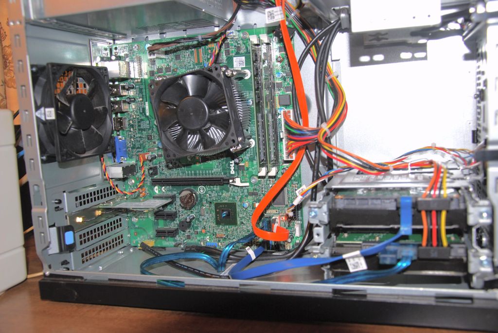
Viewed from the side the setup isn't as pretty.
I pulled out 'big disk' from the old computer to added another 1TB disk space to the system. For some that might seem a massive amount of storage but 'big disk' is already filled to the top with archived images. Shooting RAW +fine JPG on my Nikon D7000 works out to about 18MB per shutter push which can eat up a TB in a surprisingly short time. That upgrade went fine until I tried to put on the side cover and discovered the old SATA data cable stuck out a mm or ao too far.
A new cable is on order along with two PCI x1 cards to fill up the two empty slots below the wireless card. One is a dual usb 3.0 card to go with a 3TB external drive I had already bought. When I said 'big disk' was jammed full of archived image, that meant it held the digital photos I'd shot and saved until last summer. Since then I stored another 417 GB of photo onto another external disk plugged into my laptop. Do love to push that shutter button.
Since my older TV tuner card is old style PCI the other new style x-1 slot will hold an upgrade. This card has two tuners so I can watch and record 1080 pixel high def movies at the same time, maybe useful, plus a FM tuner that could replace the boom box on the bureau behind me, far less useful. Plus some addition ports like HDMI that may or may not provide better inputs if I decide to explore my D7000's excellent video capabilities.
Who knows, you might end up seeing video posts on this blog,
they did make working with rawTherapee more difficult and time consuming. Bottom line the window's version of RT barely tolerates antique 32 bit computers.
So I have upgraded my desktop from a single core AMD 32 bit CPU to an almost up to date Intel i5 four core 64 bit CPU. I say almost up to date since my CPU is an i5-2310 and Intel has come out with a slightly faster i5-2320 version. (And yes I do know that the i7 gamer CPU beats almost everything, but I'm not a gamer and right now I think an i7 would be expensive overkill for my photo editing needs.)
Until last Thursday morning upgrading was only a vague I-should-do-it-someday urge. But after grocery shopping my wife decided to stop at the local thrift store to check for vintage bargains. Since I wasn't in the mood to stand around while she worked her way down the clothing racks I went next door to Staples to buy a bag of assorted rubber bands.
Never got to the rubber bands. I walked down the computer aisle, stopped to glance at some of the prices and was about to head off to the back of the store to search for the rubber bands, when another customer mentioned "That one is quite the deal." He pointed towards a Dell Inspiron at the end of the rack sporting a $230 off sticker. When I looked more closely I saw it was semi-loaded up with 8GB of ram and a 1 TB hard disk.
By then the salesman had joined us. The first customer was only browsing and walked off as I got the full spiel. The computer was a demo and the last one left in the store. Because of the Intel CPU upgrade they had first dropped its price by $100. When it hadn't moved, they dropped the price to $230 just that morning. And so on. Ended up with me saying I wanted to do some Internet checking first and he saying he had to reset it to the factory conditions so it would be off the shelf until Friday morning.
I had a day to decide. And since the Internet had mostly nice thing to say about the model--example, in a bench mark/price comparison its i5 2310 CPU came out #1--the desktop ended up on my old kitchen table turned computer bench by Friday afternoon.
A computer bench that won't be as uncluttered until I photograph my next upgrade. As I look around I see--no you don't really want hear the full mess inventory. {The neatest additions to the mess are two wood turned black walnut tops tumbled over in a curly maple spinning dish. I bought them at an annual Artfair-on-the-Square back when some venders still hand crafted their arty stuff instead of buying it wholesale from Bangladesh or Thailand.}
The system has its first addons I walked out of the store with its wired usb mouse and keyboard under my arm but I hadn't gone more than a few blocks when I spotted a garage sale sign. A garage sale with a $3 wireless mouse and Photo Center keyboard. At that price how could I pass up the deal--especially when, to sweeten the deal, the owner tossed in a working laptop mouse.
One unexpected improvement affected my Sun workstation monitor, a tank build piece of equipment that weights 70# and must be approaching 20 years old. The new Intel video chip recognized it as a SUN0567 instead of as a generic monitor Since its colors now appear both brighter and more vivid, the video chip must be using a special driver.
Viewed from the side the setup isn't as pretty.
I pulled out 'big disk' from the old computer to added another 1TB disk space to the system. For some that might seem a massive amount of storage but 'big disk' is already filled to the top with archived images. Shooting RAW +fine JPG on my Nikon D7000 works out to about 18MB per shutter push which can eat up a TB in a surprisingly short time. That upgrade went fine until I tried to put on the side cover and discovered the old SATA data cable stuck out a mm or ao too far.
A new cable is on order along with two PCI x1 cards to fill up the two empty slots below the wireless card. One is a dual usb 3.0 card to go with a 3TB external drive I had already bought. When I said 'big disk' was jammed full of archived image, that meant it held the digital photos I'd shot and saved until last summer. Since then I stored another 417 GB of photo onto another external disk plugged into my laptop. Do love to push that shutter button.
Since my older TV tuner card is old style PCI the other new style x-1 slot will hold an upgrade. This card has two tuners so I can watch and record 1080 pixel high def movies at the same time, maybe useful, plus a FM tuner that could replace the boom box on the bureau behind me, far less useful. Plus some addition ports like HDMI that may or may not provide better inputs if I decide to explore my D7000's excellent video capabilities.
Who knows, you might end up seeing video posts on this blog,
Subscribe to:
Posts (Atom)