The great news was that this build fixed the artifact problems. The bad news is that I was in the middle of researching a fifth look at wavelets and have to redo my research.
And no, I don't have a private in with a superfast developer. He had been working on the problems for a while. And yes there are three more tutorials after this one with a fifth being written. The second is on a potential default workflow; the third is on developing a well exposed landscape shot using only wavelets; and the fourth on cleaning out the noise in pop star Lorde's latest widely shared selfie.
The tutorials have become more dated as the wavelet tool evolved so the screen shots aren't accurate.
And in the three day since I posted the Lorde tutorial I've discovered a better way of cleaning up high ISO images using the new build--one I will explain in the next tutorial.
So upgrade to RT's latest build so we can continue to explore the exciting landscape of wavelet land.]
My book on wavelets with the equations in an appendix--one written for non math types like myself--only runs 250 odd pages. So I may eventually slog through the non math pages. Wavelets are complex and don't lend themselves to short summaries. Still the one big thing I've picked up so far is that wavelets are transforms.
Just as jpgs are transforms When you convert a raw file into a jpg in the first half of the process the algorithm creates an intermediate state, the color information. If RT's software allowed you to do a reverse transform -the second half of the process- without changing anything you would end up with the same size image you started with.
Something not very useful. So you have two sliders to changing things. If you are like me, you leave the subsampling slider on balance and forget about it. The second slider, quality factor, sets the size of the jpg by finding pixels with colors that are 'close enough' and coding them into a single value. If you go overboard and set the quality factor too low for very small jpgs 'close enough' becomes "way too much" causing banding and other artifacts,
With RT's wavelet tool, instead of colors you are dealing with spacial frequencies. Think Contrast by Details with much more powerful sliders. With them you can fine tune your raw or your jpg and approach that ultimate goal- the perfect image. Or if you flip into Crazy Artist mode you can create some insanely weird images .
I created the images for this tutorial using developer's build 104. As might be expected, not everything worked. Big things like CIECAM which crashed RT. Or smaller things like edge sharpening and color adjustments that need more work. Plus there is a warning that the pp3 format will be changing and any wavelet editing done with this build won't work with the final build. Despite all this, the build was worth studying and blogging about.
I was about to post when developer's build 113 appeared in the forum. It has a set of neat fixes. Like a working CIECAM and improved edge sharpening. So instead of following a single image from loading to final development I'll be sticking in additional images highlighting what I discovered

In this screenshot I've set the strength at 100 percent--only wavelets. Strength is a useful slider since if you go a bit too far with the wavelet adjustments mixing wavelets and your original image can help cleans things up.
Of the 9 possible wavelet levels I'm using the default stack: 7 wavelets starting at level 1, the finest detail, and going on up to level 7, the coarsest detail. Levels 8 and 9 where the 'detail' is essentially the whole image controls chroma when colors are linked to these sliders (see below).
If you have an older 32 bit system you can use tile size to reduce the memory needed.
You are looking at level 1 through 4 scanned in all directions. I could have scanned horizontally, vertically or diagonally to create different looking images. While CrazyArtist images belong is different tutorials this is a good time to say that starting with a stack of wavelets can lead to some unusual images.
Wavelet image editing is not new. Google Gimp and you can find several longish tutorials on how to remove skin imperfections by modifying and combining layers. While this approach is not insanely difficult, RT is the only editing system I know of where you have everything you need in simple tool.

The jpg show a model with excellent complexion (or one who has been well photoshopped) but nobody is totally perfect. After going back to "all levels in all direction", the setting for working on the complete image, I increased the contrast of the first 4 levels. This brought out a mole, (the arrow)

Bringing the sliders for level 3 and 4 (the spacial frequency of the mole) into the negative range eliminated it.
With the 104 build when looking at the spot where the mole had been with high magnification you could see an artifact that didn't match the surrounding skin tone. With the 113 build the match is much smoother. Another fix.

You can change the chroma with this curve. Your options include 'all chroma' and 'pastel- saturated chroma'. The second option adds a slider that direct the changes from the pastel to the highly saturated colors. The third option, a non curve mode, linked chroma to levels 8 and 9. This makes far more drastic changes.
I've dragged the curve up to increase the chroma. Dragging it down would have decreased it.
This curve will be reworked. In the final release it with be replaced with another type of curve or with a set of sliders. These will allow you to set the chroma of each wavelet level separately. Something I suspect that will make some interesting looks.

Edge sharpening is another use of wavelets. With build 104 a little went a long way. The image started to create artifacts at about 8 so using it didn't sharpen much.
A big fix showed up in build 113, Now you can do this.

Coupled with NR and its median filter wavelet sharpening now works over its whole range. With not a trace of a halo. Good by unsharp mask.

At the bottom we have the gamut controls and residual image or color information. Here you can lighten or darken the shadows and highlights and control contrast and overall chromaticity. These sliders work as expected.
With build 113 for the fine tune you can leave the bottom two sliders at zero and switch to CIECAM . Its numerous curves and sliders gives you far better control over the look of the image.

The toning section in both builds hasn't been implemented. These color tab adjustments worked as expected.

On the other hand the vibrance tool modifies wavelet edited image more than ordinarily edited image.
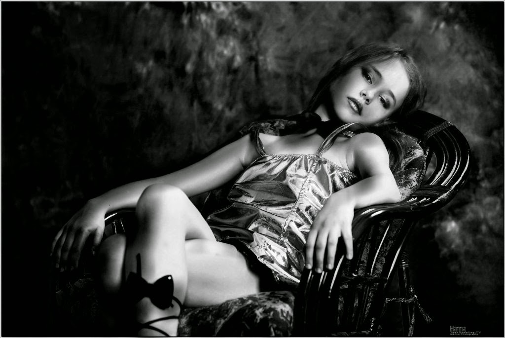
In the end I finished with a black and white edit

Where are we at now. Once the wavelet tool is finished, I suspect it will become the core of my workflow. This shot of girl-scouts during butterfly month at the local gardens was shot at ISO 3200.
The editing steps were:
1-auto exposure
2-about 6 clicks on contrast +
3-sharpening and noise reduction
4-switched to CIECAM to correct colors using a brightness parameter curve
5-final slider adjustments
6-development
7-using this image's profile to batch process a set of similar images.
Bottom line, A short, quick and high quality workflow. Wavelets RULE!
If you want to play around you can find developer's builds in the RT forum. Just remember these edits aren't going to work with the final version.


