Tuesday, September 25, 2012

In Search of Perfect Color--the New Tone Curves


I shot this a while back at the Villas Zoo during its hundredth anniversary celebration. The Young Shakespeare Players were putting on a performance of The Winter's Tale in the zoo's meeting room.  I caught these performers in a  darkish corner and ended up with a not particularly exciting ISO1600  snapshot.


But after some very quick editing I turned the snap into this.


How quick? Here is my workflow.
1-loaded the snap into RT's default mode
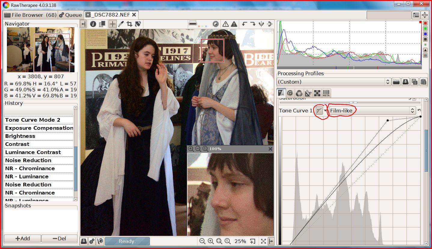
2-set the highlights with a single drag using curve 1 of the new dual tone-curve set in the Film-like mode


3-set the shadows with another single drag using curve 2 in the Weighted Standard mode.


4--adjusted the exposure slider to move the histogram to the left for saturated blacks in the actor's hair and costumes. 

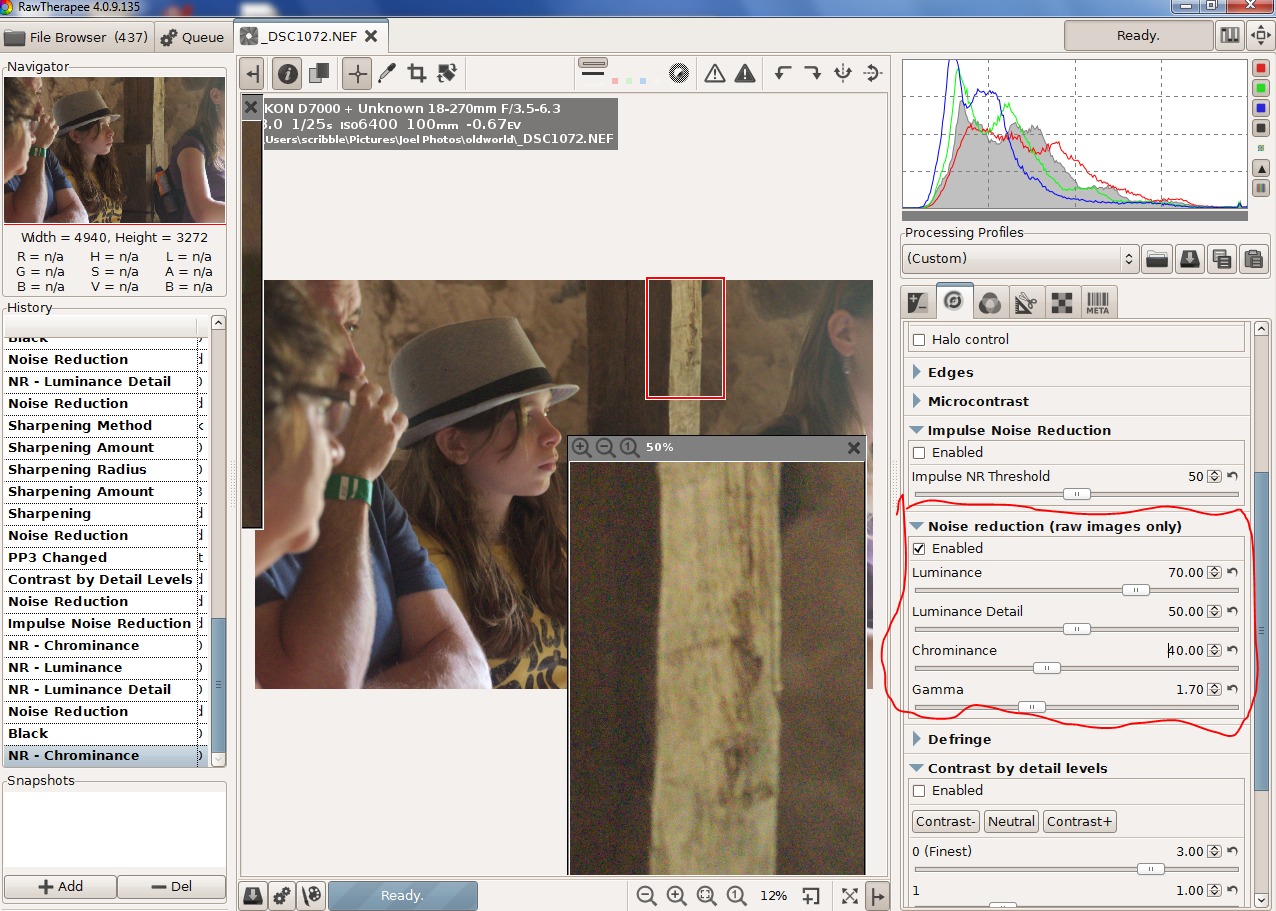
5-dragged noise reduction sliders to roughly the settings I used for my last blog post.

6-developed and then cropped the finished image in Irfanview. Why Irfanview?  Because in my excitement to see a final image I ignored the clutter surrounding my intended image.

Total working time now that I know what to do --two or three minutes per image  Be less if I batch process the other ISO1600 snaps I shot before the play began. Not quite a one click clean up but RT is getting close. Plus the results are-- pure magic!

Two things you learn when you first take up image processing:
1-unless you have developed perfect technique, usually after decades of  professional photography, images straight out of the camera improve with an S tone curve.
2- RGB colors will shift when you apply your tone curve.

Applying a S-curve multiplies the color number in all three color channels by whatever numbers are created by the tone curve.  Consider the RGB color  75,128,175 as an example. With a curve fixed at the  grey point, 128, the red value will go down, the green will stay the same, and the blue will go up creating a different color. Since images and tone curves are unique designing a reasonable algorithm that can follow and corrects these color shifts becomes near impossible .

LAB mode is different. Tone curves in the L channel doesn't shift color. Unfortunately, correcting skin tones and the like with LAB's A and B channel curves is also near impossible.  But with the RT's four HSV tone curves, near impossible is moving in on routine.


For those not familiar with HSV terminology the hue is the color.  The chroma or saturation is the intensity of the color. The value is the brightness of the color. You can read off these numbers in RT's left history pane.

RT now has four different ways of creating a tone curve: Standard, Film-like, Saturation and Value Blending and Weighted Standard. I'll leave it to the RT programmers to explain the inner workings of the new algorithms in a promised tutorial because I suspect I'll get the details wrong. Whatever the details since you can mix  and match the methods with dual curves you don't lack for ways to create excellent images.

EDIT: For more info on the four tone curve types you will find an updated manual at https://docs.google.com/document/d/1DHLb_6xNQsEInxiuU8pz1-sWNinnj09bpBUA4_Vl8w8/edit?pli=1


First why dual curves? In my example I created an S-Curve by combining two curves. This may seem like a needless complication--my first thoughts--until I saw how well and fast it works. And if you don't care for this new fangled innovation, set curve2 to linear and ignore it.

Below is a test image that one of the developers, Michael, posted. The differences are subtle and are best viewed at original size but in the dual curve version the skin tones blend in more smoothly as the lighting slides from highlights into shadows.


I haven't tested all the combinations in any systematic way but here are some tips I picked up from issue 1529 in the google code where many test images were posted.

Two standard curves (above) work well on skin tones.

Brightening with Film-like adds saturation and gives richer colors. So does switching to a wide gamut working space like ProPhoto. (I've tested this). But if you like your colors less vivid Saturation and Value Blending is the best choice.

Weighed standard for darkening and Film-like for lightening--my example--are a good combination for people pictures.

All methods work for landscapes. Selecting a mode depends on taste

Conventional S-curves work best with Saturation and Value Blend

Whatever curve modes you settle on, this unique feature is a major addition to RawTherapee's tool kit.

This version of RT 4, build 138, can be found at: http://www.visualbakery.com/RawTherapee/Downloads.aspx   An updated manual is at: https://docs.google.com/document/d/1DHLb_6xNQsEInxiuU8pz1-sWNinnj09bpBUA4_Vl8w8/edit?pli=1  


Thursday, September 20, 2012

Teen with Fedora--A Second 'First Look'

In my original post on  RAW Therapee's new noise reduction routines I had excellent results with the image of Charlotte under Lord Shiva but far worse results with some other images. The noise reduction part still worked but thick black vertical lines appeared in the converted.images.

Turns out the noise reduction algorithm broke the image into segments called tiles. It worked its noise reduction magic on each tile individually but sometimes the tiles didn't rejoin smoothly. A tricky and hard to find bug, judging from the number of posts that appeared in the forum while they were fixing the problem.

That bug has been mostly swatted--noise reduction still doesn't work on JPGs-- but with code change set 135 we can now test and work with RAW files.  ( found at http://www.visualbakery.com/RawTherapee/Downloads.aspx  )


ISO 6400  f8.0  1/25 sec  EV -0.7

This snap was taken at Old World Wisconsin in the back of a barn during a demonstration of 19th century cow milking.  The lighting wasn't insanely difficult but as you can see from the camera settings I was pushing my D7000 to get this shot.

So how did RT do when I tried to improve the image.


YUP!  RT noise reduction works,

The noisy image to the left is without any noise reduction, just a +0.7 exposure correction to compensate for the -0.7 correction I did in the camera to move the shutter speed up to 1/25 of a second. The NR settings of the much cleaner image on the left are shown below.


I adjusted the Chrominance slider first. Use a 400 % box on something with little detail like the girl's cheek. Find a setting where all the color speckles disappear and then add a bit more.  This slider works on the A and B LAB channels that only contain low resolution color information so you are not blurring detail. With my D7000 at ISO 6400 about 2/3 of the noise was chromatic so that was a no fiddling around adjustment. Nice


For the other two sliders I picked a region with fine detail, the wood grain on the 2x4, and adjusted them to match the detail in my conversion to the detail in the jpg out of the camera. The Luminance slider controls the strength of the noise reduction. The Luminance Detail slider sets the threshold on  another algorithm that does its best to seperate real detail from random noise.  In this image Luminance 70 and Luminance Detail 50 worked well.


So where are we at now.  The left top line profile is from a RT conversion with no noise reduction.
The one below that is from the camera's jpg where I used the D7000's normal noise reduction setting.  It also is very close to the noise I measured when I used RT's default settings.

The top right profile is from my detail preserving image.  And finally the insanely low noise ISO 6400 profile below it is from when I went all out with a Luminance of 90 and a Luminance Detail of 6 to see how low noise I could go.

How bad was that image.  When I displayed it side by side with my tuned image I didn't have to pixel peek hard to see I had lost detail.  But if I had emailed it to Fedora Girl I'm sure she wouldn't have screamed "WHERE IS MY DETAIL" and immediately sent it into the bit bucket. We RT users are after the very best quality but in this world drowning in imagery, I'm afraid most viewer don't notice.

So great job RT folks and especially Emil who designed the algorithms and did the coding.


Monday, July 16, 2012

First Look--RAWTherapee's New Noise Reduction

Last Wednesday during this hottest on record Midwest heat wave Charlotte and her Mom and I drove in air conditioned comfort  to tour Charlotte's favorite museum, the Milwaukee Public. There Charlotte became my guide. My Nikon D7000 hanging around my neck, she led me from exhibit to exhibit.

Excellent exhibits, I'll admit. But from a low light, hand held photographer's point of view, the trip was not a successs. The lighting, or lack of it, was the pits. Still, I snapped away and came home with a few GB's of images, hoping for some lucky shots.

What I discovered when I went to process the RAWs wasn't luck exactly. I've been following the development of RT's new noise reduction routines for over a year and I check their forum regularly. The developer's denoise compile I downloaded isn't bug free and only works with 64bit Win7, but with my new computer its match with my museum snaps was perfect.


This snap was taken at a 1/4 sec and ISO2500.  Charlotte held her pose. Image stabilization and I held the camera steady. After a 2 EV boast in exposure and a tone curve, it's a decent image to see how well RT's latest and greatest works. There is no manual entry yet but the routine turned out to be more automated than I expected and easy to work out.


The luminance slider sets the maximum strength of the noise reduction; the luminance detail slider sets how much of that maximum strength is actually used. At a detail setting of 100, no or very little noise reduction is applied. At 5 and with a strength of 20--the settings I used here--the noise reduction was both artifact free and very impressive. But I was clearly losing detail as you can see in comparison with an image with no noise reduction (right)  below


I'd gone too far. Below is a tuned version where I tried to preserve detail.


I kept the luminance setting at 20 but ran the detail slider up 60, added more unsharp mask sharpening and set the gamma to 1.4 to bias the noise reduction towards the shadows. Below is another comparison with the no noise reduction image. Beside being significantly less noisy the tuned image shows as much and perhaps even more detail than the no noise reduction image. Click on the image and go to the original size if you want a better view.

 (note--if you download this build from http://dl.free.fr/getfile.pl?file=/unoeMxPZ RL convolution sharpening is broken, When you process an image in the queue the software grabs all the available memory and crashes when it can not find more.)


To finish off this first look here are the respective noise profiles--05 detail on the top, tuned detail in the middle and no noise reduction on the bottom.


While this is not the released version and there are still some bugs to work out, I'm  very impressed. So congratulations to everyone involved.

Thursday, May 17, 2012

How Good is My Ancient Sun Workstation Monitor?

In my last post I mentioned an unexpected  advantage of upgrading my desktop--the discovery that  I now had a video driver specifically for my Sun workstation monitor.  Major result--my monitor colors looked brighter and more vivid.  Minor result--a software switch between my manual screen layout--squished in with black borders so the aspect ratio of  a square image is exact--and the driver's more open layout that fills the whole screen.

I began to wonder if I could go from 'this looks better'  and come up with some tests where I could say 'this is exactly how much better" the colors appeared.  Something like I'd attempted after I bought my first digital camera and wanted to reverse engineer how digital cameras worked. Then I photographed a fan of paint cards and compared the swatches to the colors I saw on my monitor.  With mixed results if I remember correctly.

A decade later I now understand why my naive first attempt at color management ended a bit off.  Somewhere in the house is an extra thick tome on the complexities of  eyeball, brain, camera, scanner, printer, press and monitor color processing.  Someday I might even finish reading it. During my last attempt my brain seized up when I hit the complexities of mating CMYK processing with the ink spread on various paper grades during high speed offset printing.

But I did manage to retain a few key facts. The first is color calibrate your monitor. If that is off everything that follow will be meaningless. To correct gross problems you can fiddle with your monitor controls  and attempt to match images you find on the web. But to calibrate accurately you have to buy hardware.

I invested in a Pantone Huey--at the time $99 at my local we-stock-everything craft store.  The Huey has its quirks.  The software in the box dated from the Win 2000 era and did not install on my newer OS.  Once I located the upgrade, more of a hassle to find than it should have been, I couldn't make the 'adjust the contrast and brightness control so the top right circle... etc etc' part of the setup work. In the end I set them to 75% and clicked next. Despite these quirks, the Huey did cleaned my obvious color management problems. Still I never did discover how accurate the color matches were

So I was thinking of getting out the camera and repeating the paint card experiment when I discovered http://www.color-swatches.com .  Which, not surprising, is a site with a data base of paint swatches. They even provide the RGB numbers used to create the swatch and CMYK numbers to print the color cards. Below is an example of what you find there


So all I had to do was collect some paint card.  Unfortunately finding them in stores I happened to pass while doing grocery shopping didn't work out well. Walmart's ColorPlace wasn't in the data base. Home Depot's Glidden had only one swatch on line that matched the cards I took.  In the end I made a trip to Sherwin Williams. It has a swatch for every paint it sells. This combined with larger than normal paint cards printed on thicker than normal paper stock makes it my recommended store for swiping your cards. 

With cards in hand I download a swatch.  And I hit my first technical problem.  Monitors blasts out light. The paint cards, on the other hand, reflect light. Depending on the light quality (intensity, color temp and all that jazz) they will, more often than not, look different than the monitor swatch.  After holding card by the monitor I could say the swatches sort of looked the same. but that wasn't the accurate one-to-one comparison I wanted.

After some fiddling I discovered if I opened the curtains of a window to the left of monitor and angled the card up or down to catch more or less light I could match the intensities.  But I still ended up with a so-so color match.  Close but hardly perfect like in the photo below.


I must confess to spending far too much time fiddling with controls while the answer to the problem stared me in the face.  Quick question. What is causing the green cast on the swatches of the lighter blue paints?  After all Sherwin Williams wouldn't mix a little green pigment in with its expensive blue paints.

All I had to do was carry the card to the window, twist it first to face the window light and then away, to watch it switch between slightly greenish and pure blue. The Wisconsin clear sky sunlight had started out pure. But once it was reflected off the green leaves that shade the patio below the window it had a greenish component.

Problem solved. Color cast in the light.  Factor that out and the match between real object and monitor image colors becomes almost perfect.  Some days life is good.

Or close to good. Measured with Gimp, the RGB numbers on a swatch are what www.color-swatch.com says they should be.  Measure with RawTherapee using its neutral profile, one that is supposed to display an image exactly as shot, and the numbers end up 5 to 9 units lower  So after I post this I should be a good RT user and also post a bug report.

Edit

The  RGB 5-9 off bug is when I save a swash snip in png format. When saved in jpg format the numbers are off by 1.

And not surprising when you think about it, the green colorcast that had me twirling about mentally yesterday depends on the time of day and where the sun is in the sky.  Around noon when trees are in direct sunlight the reflection off the leaves is a problem.  But earlier this morning when I repeated the test and the sun was much lower in the sky the match was so close I could hardly make out the seam where the card touched the monitor swatch.

Ain't color management tricky ... but fun.

Sunday, May 13, 2012

No Excuse for Not Posting Anymore

I haven't posted for a while. And while I can't truthfully say this was all due to compute problems,
they did make working with rawTherapee more difficult and time consuming. Bottom line the window's version of RT barely tolerates antique 32 bit computers.

So I have upgraded my desktop from a single core AMD 32 bit CPU  to an almost up to date Intel i5 four core 64 bit CPU. I say almost up to date since my CPU is an i5-2310 and Intel has come out with a slightly faster i5-2320 version. (And yes I do know that the i7 gamer CPU beats almost everything, but I'm not a gamer and right now I think an i7 would be expensive overkill for my photo editing needs.)

Until last Thursday morning upgrading was only a vague I-should-do-it-someday urge. But after grocery shopping my wife decided to stop at the local thrift store to check for vintage bargains. Since I wasn't in the mood to stand around while she worked her way down the clothing racks I went next door to Staples to buy a bag of assorted rubber bands. 

Never got to the rubber bands.  I walked down the computer aisle, stopped to glance at some of the prices and was about to head off to the back of the store to search for the rubber bands, when another customer mentioned "That one is quite the deal." He pointed towards a Dell  Inspiron at the end of the rack sporting  a $230 off sticker. When I looked more closely I saw it was semi-loaded up with 8GB of ram and a 1 TB hard disk.

By then the salesman had joined us. The first customer was only browsing and walked off as I got the full spiel.  The computer was a demo and the last one left in the store.  Because of the Intel CPU upgrade they had first dropped its price by $100. When it hadn't moved, they dropped the price to $230 just that morning. And so on. Ended up with me saying I wanted to do some Internet checking first and he saying he had to reset it to the factory conditions so it would be off the shelf until Friday morning.

I had a day to decide. And since the Internet had mostly nice thing to say about the model--example, in a bench mark/price comparison its i5 2310 CPU came out #1--the desktop ended up on my old kitchen table turned computer bench by Friday afternoon.


A computer bench that won't be as uncluttered until I photograph my next upgrade. As I look around I see--no you don't really want hear the full mess inventory.  {The neatest additions to the mess are two wood turned black walnut tops tumbled over in a curly maple spinning dish. I bought them at an annual Artfair-on-the-Square back when some venders still hand crafted their arty stuff instead of buying it wholesale from Bangladesh or Thailand.}
 
The system has its first addons  I walked out of the store with its wired usb mouse and keyboard under my arm but I hadn't gone more than a few blocks when I spotted a garage sale sign. A garage sale with a $3 wireless mouse and Photo Center keyboard.  At that price how could I pass up the deal--especially when, to sweeten the deal, the owner tossed in a working laptop mouse.

One unexpected improvement affected my Sun workstation monitor, a tank build piece of equipment that weights 70# and must be approaching 20 years old.  The new Intel video chip recognized it as a SUN0567 instead of as a generic monitor  Since its colors now appear both brighter and more vivid, the video chip must be using a special driver.

Viewed from the side the setup isn't as pretty.


I pulled out 'big disk' from the old computer to added another 1TB disk space to the system. For  some that might seem a massive amount of storage but 'big disk' is already filled to the top with archived images. Shooting RAW +fine JPG on my Nikon D7000 works out to about 18MB per shutter push which can eat up a TB in a surprisingly short time. That upgrade went fine until I tried to put on the side cover and discovered the old SATA data cable stuck out a mm or ao too far.

A new cable is on order along with two PCI x1 cards to fill up the two empty slots below the wireless card. One is a dual usb 3.0 card to go with a 3TB external drive I had already bought.  When I said 'big disk' was jammed full of archived image, that meant it held the  digital photos I'd shot and saved until last summer. Since then I stored another 417 GB of photo onto another external disk plugged into my laptop. Do love to push that shutter button.

Since my older TV tuner card is old style PCI the other new style x-1 slot will hold an upgrade. This card has two tuners so I can watch and record 1080 pixel high def movies at the same time, maybe useful,  plus a FM tuner that could replace the boom box on the bureau behind me, far less useful. Plus some addition ports like HDMI that may or may not provide better inputs if I decide to explore my D7000's excellent video capabilities.

Who knows, you might end up seeing video posts on this blog,

Monday, February 20, 2012

Mistakes--Serendipitous

By Madison in Febuary standards last Saturday was balmy. Despite the sunny, mid 40's weather my D7000 and I spent the afternoon indoors at the Olbrich Garden photographing the Children of the Rain Forest.

This month's performers were the Hale O Malo Polynesian Dance Group, Their costumes and dances ranged from a New Zealand  Maori war dance to a Tahitian fertility dance. That invocation of human fertility came with a friendly warning, "Do not attempt this at home."


This image was shot during the pictures-with-the-kids session at the end of the show using my new Tamron 18 -270 mm f3.5-5.6 super zoom set at 18mm wide angle.  The manual exposure settings were f8 and 1/200 sec combined with an auto ISO. That ended up at 6400.

Not an optimum or necessary ISO for this image. It could have been much lower.  At 18mm the lens opens at f 3.5. For a static shot a shutter speed of 1/60 sec would have worked. But I had set up the camera for telephoto dance images, 1/200 sec to give a sense of motion without excessive blur and f8 to sharpen up the lens's slightly soft long end. I didn't spot any massive noise problems when I reviewied the screen shots during the shoot so I went with the default settings.

For post processing I downloaded RAW Therapee's latest 64 bit build, version 4.7.01. It doesn't have the new noise reduction routines yet, but it does have enough new features to  justify a build jump from 4.6 to 4.7.  I'll talk about a few newfeatures in this post, plus some older ones that I haven't used much, starting with the big review images in the file browser.

With dance groups I tend to over shoot.  You know, long continuous bursts hoping to capture that perfect combination of step, twirl and jump. This time I filled my 16 GB main card and moved down to my 8GB secondary card. There I found Miss Thumps-Up posing for Mom's perfect snap combined with an interesting environmental background.

Viewing the preview jpgs full size on my laptop screen while using the number and color coded ratings sped up my selection workflow. I ranked my 'maybe images' during a first pass and then fine tuning the selection set. Definitely a winner.

Judging by the curve of the molding board at the top, this image, shot at 18mm, has serious wide angle lens distortion.  So I tried the fix in the Transform/lensgeometry/distortion tab. My first guess, a -0.5 pincushion setting went way over the top. But it did open up ideas for some creative playing around later.


The for real setting was -0.09.  I pulled up a grid Guide Type to provide straight lines as a reference. At the moment the routine bends the image only one way and creates a curved blank area at the bottom. So I used auto fill to clean up that problem. And for those interested in composition rules the Guide Types include rule of thirds, rule of diagonals and several harmonic mean or, as I used to call them, golden sections.


With the proper settings I created an '18mm tamron' default profile that I can call up to automatically correct my wide angle images.

This fixed I tried out a  new profile that came with RT 4.7-- 'default ISO high'. After I applied the profile  it was  'WOW!! Where has all the ISO 6400 noise gone!!?'

Turns out the RT team had done some interesting things but the real WOW maker was my serendipitous mistake. I'd been working with the jpg not the NEF file, a jpg that had already gone through one pass of the Nikon D7000 excellent in-camera noise reduction routine.

I posted twice last August about how well RAW Therapee works as a jpg editor   My mistake turned up another use- one that is especially helpful to someone who shoots flash-less low light party and people photos.

Here is the most interesting settings in the 'default ISO high' profile along with my modifications.


I left the Impulse Noise Reduction at 80. Luminance comes up as 0 so I set that to 20. Gamma 1.2 has the effect of shifting noise reduction into the shadows where it is needed the most. As usual the effect of all this is to blur detail (bad) while removing noise (good).

The RT folk's ingenious addition is to use 'contrast by detail levels' to recover a surprising amount of the blurred detail. The default values are 0 (finest) =1.00 and the next level '1' =2.00 but at the time I was thinking noise rather than detail;  So I may have gone a little too far fiddling with the sliders and cut out slightly more detail than the noise reduction needed. Either way, the noise cleanup and preserved detail  on this ISO 6400 image is dramatic.

How dramatic. Here are my results. And unlike the Tahitian fertility dance you should definitely try this at home.


The image on the left is from the NEF using the current noise reduction routines. It has the highest noise. It also has the most preserved detail in the girl's hair so I could have pushed its noise reduction harder.  The middle image is the jpg from the D7000 using its default jpg (Sd) and noise reduction (norm) settings. While I wouldn't have called it bad a week ago, now it looks flat and washed out next to the RT image on the right. I lost some detail in the hair but with the noise now so low I can print it up large, perhaps to 11 by 14, without showing objectionable noise. Not shabby for an ISO 6400 image.

Lesson learnt. At the moment there is no advantage working from NEFs using RT. Not that this is a massive bash; the D7000 has one of the best in-camera noise reduction algorithms around. And judging from the comments in the forum, RT should get better soon. See Issue 1052: New luminance NR algorithm  http://code.google.com/p/rawtherapee/issues/detail?id=1052  for up to date details.

With a CPM member's show coming up and several low-light images I'm considering exhibiting, it is time for some serious post processing. Will let you know how everything works out.

PS. The line profiles were taken off the wall over the girl's shoulder.


Monday, January 23, 2012

Noise Reduction RT vs 'the others'


Two months or so back I had this post all planned out  The 'other' was to be my antiquated version of Adobe Camera RAW that came with Photoshop CS3. When I compared the noise on two of my images RT clearly lost with one image but tied with the second. Slightly confusing.

So I checked the RT forum  to see if there was some info I had missed. There I learnt that the noise reduction routines were being  rewritten.  I decided to wait for the revision. Then life interfered with blogging and I didn't come back to this until a few day ago.

mbod had already done the comparison where his 'other' was NeatImage.  The link for the discussion is http://www.rawtherapee.com/forum/viewtopic.php?f=1&t=3708  He provided this screenshot; I measured the noise in the sky with ImageJ


The interesting thing about these measurements is the noise profiles are nearly identical even though the RT processed image on the right looks much noisier. (click to view original size) That's caused by the relatively large chromatic blotches emil talk about in the forum post. They are what you see but since a line profile only measures noise that is a pixel wide, it makes the Signal /Noise look better than it really is.

Normally I do most of my photographic work on my 32 bit desktop machine. While I have 32 bit memory management problems, I also have a semi ancient Sun workstation monitor that was built to last.

And has lasted. With a large 1600 pixel screen, the monitor can be calibrated and color managed so the colors and values on the screen are identical to those I see on my prints. Just as important when I raise or lower my head, the image intensities don't change like they do on my laptop screen.

But this time I used the 64 machine after I downloaded mbod's RAW file. And I was surprised by what I saw after I ran it through RAW therapee.

The noise profile of the 64 bit jpg (left) was much less noisy than I expected. More important it didn't have the chromatic blotches that I have in my 32bit jpg (right) and that mbod had in his conversion.  (click the screen captures to view their original size). Big shock to discover there was that much difference between the two versions of RT.


     Both jpgs were converted using identical settings. The formula used was exposure compensation to correct for underexposure followed by RL sharpening with a radius of .50 and amount of .24. This was followed  by impulse noise reduction of 75 and luminous noise reduction of 49. All other settings were left at the default values.

glascort also posted a NeatImage conversion which I compared to my 64bit jpg.  While my noise is 4 times lower I lost fine detail like the guy wire on the tower (circled in red).  Larger detail like that on the side of the building (circled in blue) wasn't affected. But there is no question that my version is less crisp than the glacort's version.


That turned out to be rather easy to fix. I loaded the 64bit jpg into RT and upped the Lab mode contrast to around 30. That brought out more noise so I added a bit more impulse noise reduction. As you can see in my reworked jpg on the left, the noise is still lower than the NeatImage jpg, the overall image is as crisp and I recovered the lost guy wire (circled in red).


   While I don't have any of the 'others' installed on my 64 bit machine yet, I feel the current 4.0.6.3  64 bit noise reduction is quite good. So we might be far closer to overtaking ACR than some believe.