Sunday, December 22, 2013

First Look at RawTherapee's new B&W conversion tools

Been a while since my last tutorial. It's partly because of the press of other commitments, also known as procrastination.  And partly because of a real medical condition effecting my eyesight brought on by, among other things, being too friendly with a high powered UV laser during my misspent youth. But that problem seems to have stabilize so it is unlikely you will ever see an image of me sprawled on the the sidewalk next to a stack of   blurry prints, an old can and a sign saying 'please support this near blind photographer.'

"Blind photographer" turns out to be not as wild a joke as I originally thought. 
 A google search brought up
 http://lens.blogs.nytimes.com/2012/09/18/visions-of-a-blind-photographer/

With luck this excellent essay should come up on your screen. Unless the NY Times has changed its policy everybody has 20 free articles a month before they must subscribe.

The big news in RawTherapee is a Black and White tool kit that 'blows the pants off' every other image editor out there. Or should that idiom be 'blows the pixels off the print'? With algorithms by Jacques, the same developer who gave us CIECAM02, it can both mimic a film darkroom while still providing all the quirky effects my hidden artist will learn to love.


The first image I will convert is courtesy of Charlotte-- the artistic kid who has been featured in earlier blog posts. It's her entry in her 1st grade art exhibit six years ago. Would have been the grand prize winner if the first grade was more competitive and awarded grand prizes.

The black and white tools are found in the color tab.


The first of three, Desaturation, produced this. As with a greyscale in Gimp or Photoshop all RGB values are identical. While sliders can adjust the gamma of each channel, the tool's two curves provide most of the adjustments. The 'before' curve works on the RGB colors before the conversion to BW. The 'after' curve works on the 'L' channel after the conversionl So it changes the image differently. Like all other RT curves there are four choices--linear, custom, parametric and control cage.


This mild parametric curve did darken the shadows and highlights slightly  even if its effects aren't blindingly obvious/


This far more drastic custom 'after' curve darkened the image more than I'd liked so I tried to fix it by upped the exposure.


This switch to an almost negative image is not what I expected to see. It's not a bug. There is nothing boringly linear about Jacques's algorithms. Tool tips warn about artifacts when you push sliders and curves too hard. My hidden artist thinks differently and proclaims.  'Not artifacts! Great new features!!' And if linear is your thing, just don't push the sliders and curves so hard, Or move on to the second tool- the Luminance Equalizer


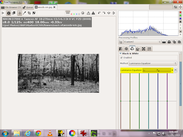
Unlike the Desaturation tool that works on the whole image the Luminace Equalizer lightens or darkens specific colors.  Such as the golden foliage in this jpg.


The original B andW image is dark and a bit blah so--


I grabbed the yellow color and lighten it by pulling it up in the flat field editor. The latest version of this editor has a great enhancement--a bar at the top that shows what color you are working on. Drag the cursor to the left and the color shifts towards red. Drag it toward the right and it shifts towards green.  And if you drag it down you darken rather than lighten the color.

Like all of the B and W tools, you can also tweak your image with a curve.


This 'after' curve darkened the the fallen leaves on the ground.


Both of these tools are useful but the real action is in the Channel Mixer. Lets see what I can do with this shot of trees in a wild life preserve on the edge of Lower Mud Lake.


I have software color filters to work with. They mimic the physical filters you would screw on the front of a lens when using film. As an example the #33 dark red filter I used to carry in my camera bag would block the blue and darken a sky.


I also have presets. The four labeled Channel Mixer ... down near the bottom are fully adjustable. The others have only gamma sliders and are adjusted by curves, the color filers or RGB sliders outside the the B and W tool section.


I'm interested in a look that mimic 19th century wet plate photos with their totally blown skies.
The orthochromatic preset seemed to be a good place to start. It cut the red to 0% and lighten the sky but there was still too much green.


So I added a blue filter.  While it cut the green to 3.5% and reduced the trees and field to a silhouette the sky still had detail.


An 'after' curve lighten the image. Better but it still wasn't quite the effect I was after.


In this build the labeling of Channel Mixer Absolute ROYGCBPM is confusing. The ordering of the eight color sliders are red, green, blue, then orange, yellow, cyan, purple and magenta.


Bringing the yellow slider down to -100 lightens the sky and is nearly the effect I'm looking for.


Moving the orange slide up to 102 darkens the sky.


But pushing the orange slider to 129 now lightens both the sky and image.


Move it one more step to 130 and the lights go out. They stay out until about 185


Then the image flips over to white. It started to come back until at 200 I ran out of orange slider.


Then by pushing the magenta slider to 170 I hit the 19th century wet plate look I was after--totally blown skies coupled with excellent tonality in the trees and fields.

Is all this a major bug? Apparently not. If you look at the now closed issue 2010 at https://code.google.com/p/rawtherapee/issues/detail?id=2010  you can read two months of developers' posts on non linearities and other matters. The consensus appears to be 'this is the way the algorithms work so learn to live with them'.

You can also uncheck the 'adjust complimentary colors' box and the sliders will work very differently. But that will be part of another post. It's time to start thinking about digging out from last nights snow storm.

Both at 32bit windows and  a mac version of build 203 are now up in the RT download page at
http://rawtherapee.com/downloads



Saturday, October 19, 2013

Creative Distortion with My Lady Clockwork


I found this hanging from the side of a booth at an art fair this summer. An image worth a touch of RawTherapee. After adjustments with CIECAM02, my usual workflow that I have blogged about several times I ended up with a more colorful version of the of the image. It was okay but I felt it need something more. So I went to the prospective correction section and went a bit wild with the sliders


My first attempt created the elliptical gearing fot the right artistic touch but the triangle of grey at the lower corner distracted form the composition.


With different slider adjustments, a rotation and finally a conversion to B&W by bring the CIECAM02 chroma to -100 I ended with this image.


I posted this on flickr 16 hours ago. When it came to filling out the tags and picking the groups I couldn't quite decided how to publish this.  So, for a bit of fun and because My Lady Clockwork is naked in her stain glass beauty, I added the tag nude.

Nude is a popular search tag.  At last count I've picked up 313 'what-in-the-expletive-world-is-this' views with 95% coming from a search for a nude something or other.

And finally since art can never be totally finished I played around after my posting and came up with this which I think is a tighter and slightly better composition


Thursday, June 20, 2013

Infrared--RT's simple workflow.

I've never been that wild about taking infrared images. Not because I don't enjoy looking at them. Rather it because I spent multiple years of my working life designing, building and servicing unusual and very expensive infrared instruments. Learning the ins and outs of IR photography wasn't going to teach me anything I didn't already know.

So I was more interested in seeing how flickr's new interface worked when I happened to visit the discussion area in flickr's Digital Infrared group three day ago.  The thread that caught my eye was on Lightroom, infrared images and some over complicated problems you face using that editor.  I was about to jump into the discussion and shout out all the ways RawTherapee works better, when I thought it wouldn't hurt to process an IR image to check that I knew what I was taking about.

After searching around in my backup folders-- I had vaguely remembered taking a infrared set three or four years ago--I found these images.  And yes, the much simpler RT workflow that produced these little masterpieces is worth blogging and bragging about.


My IR camera is a digital antique, a 3.2 MP Olympus 3020Z, the first digital camera I owned. It has, by today's standards, a weak IR blocking filter. When combined with a Hoya R72 filter it takes a decently exposed sunny day image using shutter speeds of 1/8 of a second.

I must have used a tripod when I took this in 2011. But while preparing for this post I discovered I could loop my camera strap around my neck and use my two legs and my monopod/walking stick to create an impromptu tripod stable enough for shake-free IR images. Big advantage. I'm a handheld photographer.  I'm not interested in lugging a tripod around when I'm out hiking with a camera.


Now the workflow using 64 bit RT 4.0.11.1.


Although I didn't highlight it, up at the top you can see this is a tif file. Without any post processing it loads up with  a perfect 'white balance.'  This is caused by the camera's unusual sensor, one that uses a yellow, cyan, magenta demosaicing filter instead of the standard Bayer red, green, blue filter.

During the camera's internal calculations to create an RGB image that can be displayed on normal monitors several things happen.

1-The camera creates identical RGB channels from the internal IR RAW values. This is an excellent starting point for B&W images and a no-go for any false color IR images. For those I'm going to have to use a different camera.

2-The blue sky noise is half of what one would expect using a RGB demosaicing filter. At the time this was a marketing tool. I remember one salesman holding up a 30in print of mostly blue sky to promote the noise figure of the camera his store was pushing that month.  He also ignored me or didn't understand me when I pointed out some of the technical reasons his big print didn't prove anything.

3-The biggest and most not technical reason was that in normally printed,  real world images blue sky doesn't need  noise reduction. My 3020Z has low noise highlights coupled with high noise shadows with about twice the noise of a similar RGB camera.. Why? There is a signal averaging step in the calculations which degrades the low signal results when making this type of comparison.

As for the TIF file--whatever version of RT I was using 3 years ago didn't do jpgs. So I was stuck with oversized tifs, 7 images only in the 128MB memory cards that were considered huge storage back when I bought the camera.

From the history pane, I played around with the noise reduction before I did any sharpening. You can do the same thing in two steps by switching to a default ISO noise profile and tweeking the exposure slider. With no sharpening and RT's noise reduction there is no visible noise in the black sky even when displayed 400%


While I've brought up a trace of noise with sharpening , look at the detail in the trees full size to see what I've done to improve the overall image.


With a camera this old it's not surprising to find a hot pixel that require a trip to GIMP.


The clone stamp tool fixed that problem.

 Once again here is what I loaded into my flickr account. In the last two day it has gotten a decent number of views, comments and favorites from other IR photographers.  http://www.flickr.com/photos/scribble1/9078069848/


This is an image I took yesterday-one not as visually interesting but taken only a few steps away from my front door.  It is the street entrance to the greenway that  loops around behind my back yard and leads to Pilgrim park.  Long time viewers of my flickr account might remember the nature walks with young Charlotte that always seem to end at the slides and swing sets there.

With this I tried a different sharpening tool-Contrast by Detail. Notice that I dragged the first slider back to reduce single pixel noise.


While this is out of order and happened before the sharpening,  I found the line of trees a bit boring and added an artifical vignette,


For one final editing step I flipped the image.  The jury is still out on the question 'improved composition?' What do you think?


Or?


 To download RawTherapee 4,0.11.1
http://rawtherapee.com/downloads

An up to date english  manual come with the download package. You can also find it plus non english language manuals that arrives as RT volunteers translate them at:
http://rawtherapee.com/blog/documentation


Wednesday, June 5, 2013

Noisewise, Is My Camera Meeting Spec?

Noise spec? you ask.  Point to where that is printed on the camera's spec sheet, you demand.  Sorry, camera manufacturers don't  spec their noise or more accurately their signal to noise ratios. Why? Maybe it's because some of us meany pixel peepers might take the number seriously and start demanding refunds. Or, to be more charitable, it might be because accurately measuring a camera's S/N ratio takes more than a look at a computer screen?

Physics-wise, S/N ratios are complicated. Photon shot noise, addition in quadrature, Poisson  statistics--those sort of things. Complications on top of complications.

A more reasonable question would be "Is my camera as good as the camera that was used  to take the photos for the review I read on my favorite photo site? The one that convinced me to buy the camera?"

If you are lucky, yes. More likely, no. Any marketing manager worth his corner office will make sure the cameras sent to review sites were hand picked for performance. But your camera should be close or you do have the right to demand your pixel peepin' refund.

This came up in the forums recently. A new user had bought a 'bridge' camera or, as I used to call them before marketing folks invented the name, a super zoom.  Those types of cameras have little sensors since, among other things, their light weight and inexpensive super zoom lenses only make little circles of focused light. Since they also pack about 12 megapixels into their little sensor--lets say the trade offs are not favoring S/N ratios and low light performance.

Our new user picked the right place to fix his noise problems even though his expectations were originally too high. RawTherapee has great noise reduction tools but there are limitations. So a question came up. Was his camera's S/N ratio within 'spec'?

Here is the workflow I used to work out the answer by using a comparison image, RawTherapee and ImageJ

I've already posted a tutorial on how to create a noise profile in ImageJ so I won't repeat the steps here.  http://scribble-jpc.blogspot.com/2013/03/crreating-noise-profiles.html

Imaging Resource is the place to go for your comparison images. http://www.imaging-resource.com/ They have created a massive data base of reference images going back to the days when a 2 megapixel camera equaled a $1000 investment. And they did things right from the start, controlling details, such as consistent lighting, needed to create reference images that highlight real differences between individual camera brands.

To download your comparison image pick your camera in the review pages, go to the sample tab and then the sample image page.


Near bottom and after a multitude of jpg images you will find Raw downloads of their multi-image test shot taken with your camera's various ISO settings. It has the Macbeth color chart we will use. I downloaded the ISO6400 version  to compare it with  the bowling alley picture I blogged about earlier.
 http://scribble-jpc.blogspot.com/2013/03/shoot-at-iso21000-print-at-30-by-45.html


Using the neutral profile I converted both NEFs  into jpgs before loading them into ImageJ. That conversion insures I was doing a real apples to apples experiment. If your camera doesn't take RAW files, obviously you must use jpgs but then your test image must have been taken with the same setting as the reference image for any meaningful results.


Pick the closest match you can find on your image, the wall behind Rhianna, and on the Imaging Resouces' multi image, the #4 gray scale box.  Run your profiles. Compare the graphs.

That's it. Twenty minutes time max and you know how well your camera is working. Take a few more measurement, let ImageJ do the signal averaging and you have an accurate S/N number.  Then you can brag about your new camera's performance in the forums. Or. more important, toss down a hard copy on the service desk if your camera needs fixing.

As for the new user who just posted his "Thanks" -- "You're more than welcome since your questions inspired this tutorial."

You can find RawTherapee 4.0.11.1 here. The package includes an updated manual

http://rawtherapee.com/blog/rawtherapee-4.0.11-released


Friday, May 10, 2013

A Study in White and Blue

On a bright and warm May day earlier this week-today is grey and chilly- I went to the Olbrich Gardens to field test new optics. Last Saturday I had bought an oldish Nikkor 50mm f1.8 lens that uses my D7000's internal motor to focus along with a set of extension tubes with all the electrical and mechanical connections needed  to completely control the lens. The hidden artist do-something-different challenge I took on was to leave my zoom lenses in the camera bag and shoot with only the 50 mm lens.

The magnolia trees were in bloom and the sky was blue with wispy clouds. My original shot with RT's neutral profile. Obviously it could use a dose of RT magic.


After a white balance on the magnolia leaves and a default profile.  This version is better but the hidden artist within wanted a bit more ump


The HSV Equalizer tool has been updated  and is now less finicky to use. Dragging its blue bar up or down to change the value or lightness of the blue in the sky seemed appropriate. Here is up. It didn't make a massive amount of difference since the sky's value was already high.


 And here is down which did. Notice how the  blue channel has shifted to the left in the histogram


With the value curve reset I played with the blue saturation curve. Here is up.


And here is down. 


With this image it may not be immediately obvious but a judicious use of both the value and saturation curves is a great way to improve skies without going over the top like I'm doing now. The Hue curve rotates the color wheel to create totally aliens skies. This green version is one of many.


After settling on a moderate increase in the sky's value I went on to the CIECAM02 tool. A large contrast boost of 80 made both the sky and the tree far more dramatic.


And to lighten the clouds  I upped the brightness to 25.


To bring down the blues I played around with the Colorfullness curve.


And as a final comparison here is where I stated once again.


RT's color correction tools are the best around, period. So load up an image the could use a little sky magic and start dragging curves and sliders. I predict you will like what you discover.