Sounds insane. ISO21000 noise. Huge print size. Welcome to the world of RAWTherapee noise reduction.
Rhianna is letting the world know she just bowled a strike.
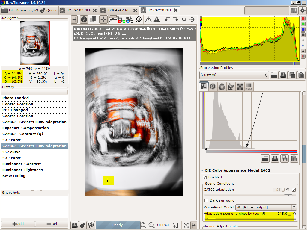
The gory photo details. The camera was set to ISO6400-- which is just a conventional way of saying the D7000's sensor's true and only ISO100 signal is preamp boosted by a factor of 64 before it enters the A/D. Since the photo had to be boosted again by an exposure compensation of 1.8EV to shift the red histogram I multiplied the camera's ISO by 3.24 (1.8 squared) to get a correct noise IS0 of 21000.
Ain't a cheating fudge factor. That's how sensor physics works.
Now the triumph of RT noise reduction. But first here is what not to do.
I set the exposure compensation correctly before I went to the CIECAM02 tools to improve the color, contrast and lightness. But I forgot to return to exposure to readjust the histograms When I caught my mistake, I checked the red color channel ( box at top) for blooming (red areas).
Because I liked my CIECAM02 fine tunings, only one channel was effected and the blooming area areas weren't in any critical part of the image (see http://scribble-jpc.blogspot.com/2013/02/rescuing-really-important-snapshots.html ) I decided to go with my mistake. After all I was getting a WOW Signal to Noise of 20!
Wrong move. After wasting a bunch of time and discovering a few nagging inconsistencies I corrected the exposure comp. One measurement later and I discoverer the real double WOW WOW S/N was to be 28!!
A few points on experimental techniques. I took the noise line profile off Jilly's arm because that area has constant color--the curves are flat-- and the arm is close to the center of the tonal range--95 in a range of 0-255. These curves have to come out flat or don't bother doing the extra work to come up with a numerical signal to noise. You will be measuring bumps and slopes. Not the noise.
Looking more closely I should have shortened the length of the line profile of the last measurement to get rid of the bump at the beginning. That error added about 0.5-1 to the last StdDev (standard deviation) number. That's why I averaged 7 measurements to clean up these errors. Even without these moments of carelessness, remember we are dealing with noise. Three measurement are a minimum, 7 to 9 are better and a 100 measurements would be an insane overkill. We are doing a square law experiment and the Law of Diminishing Returns kicks in with the second measurment
Plus what's so wow about a S/N of 28. Why not 280 or even 2800. If you got the bucks to buy the camera, like the Hubble Space Telescope or the Kepler Cosmic Background Radiation Telescope in the news recently, you can go for those high S/N ratios. But for the rest of us, with this image taken under these exposure conditions, a S/N of 28 does equal a 30X45 poster pined to a bedroom wall.
With modern tech we can pixel-peep (and complain about what we see) far too easily. Rhianna's face is 8 inches wide on my super calibrated monitor (something that the world can't see --- for the complaint http://scribble-jpc.blogspot.com/2013/02/in-search-of-perfect-eyeball-monitor.html ) . It is 3 inches on a 11 by 14 print I had made using the older 4.0.9.185 noise reduction. Do the math and this is what you will see on a 30 X 45 inch wall poster.
That print had a S/N of ~15. If you were looking for noise there was a hint of it on Rhianna's face and in the brown area under the big number one in the background. But it's nothing that jumps out at you. I sure Rianna's mom won't complain when I give her the print next time I'm over in her part of the city.
EDIT--If you looked at this post before you might notice that Jilly has suddenly morphed into Rhianna.
Rhianna is Jilly's stepsister. They both live across the street from Charlotte. I got their names mixed up. Sorry girls. :-(
After I posted this I remember I do have a big display my flat screen LCD TV with its port in the side for usb sticks and memory cards. When I displayed this image big it looked just like I said it would from my calculations.
The details from the pp3. I started with the HighISO profile. The exposure comp of 0.88 I set. I may have fiddled with that other setting. Or they may have come with the profile.
[Exposure]
Auto=false
Clip=0.02
Compensation=0.88
Brightness=2
Contrast=22
Saturation=5
Black=332
HighlightCompr=0
HighlightComprThreshold=33
ShadowCompr=50
CurveMode=Standard
CurveMode2=Standard
Curve=0;
Curve2=0;
The image needed some sharpening. Except for 'only edges' the setting are the defaults. If it wasn't for the 'only edges' algorithm I never would have dared using sharpening on a high noise image.
[Sharpening]
Enabled=true
Method=usm
Radius=0.5
Amount=125
Threshold=20;80;2000;1200;
OnlyEdges=true
EdgedetectionRadius=1.8999999999999999
EdgeTolerance=1800
HalocontrolEnabled=false
HalocontrolAmount=85
DeconvRadius=0.75
DeconvAmount=75
DeconvDamping=20
DeconvIterations=30
White balance off Jilly's shirt
[White Balance]
Setting=Custom
Temperature=3058
Green=0.80500000000000005
The color and appearance fine tuning
[Color appearance]
Enabled=true
Degree=100
AutoDegree=true
Surround=Average
AdaptLum=16
Model=RawT
Algorithm=JC
J-Light=27.100000000000001
Q-Bright=-1
C-Chroma=-5
S-Chroma=0
M-Chroma=0
J-Contrast=44.5
Q-Contrast=64.5
H-Hue=0
The HighIso defaults. I could have fiddled with them for a better S/N but why bother. My 30 inch printer-imaginary- is out of ink-imaginary- and will stay that way given the cost of feeding a real printer. For five bucks and change I can get a 12 by 18 inch print from my local Woodmans-one that matches the image on my screen. As long as I switch the room lights back ovet to 5000K spots. Perfect color management ain't easy.
[Directional Pyramid Denoising]
Enabled=true
Luma=50
Ldetail=50
Chroma=50.689999999999998
Method=Lab
Redchro=0
Bluechro=0
Gamma=1.7
Find RAWTherapee 4.0.11.1 here
http://www.visualbakery.com/RawTherapee/Downloads.aspx
For an excellent tutorial on noise by Emil, the guru behind RT's new noise reduction systen
http://theory.uchicago.edu/~ejm/pix/20d/tests/noise/noise-p2.html